We independently select these products—if you buy from one of our links, we may earn a commission. All prices were accurate at the time of publishing.
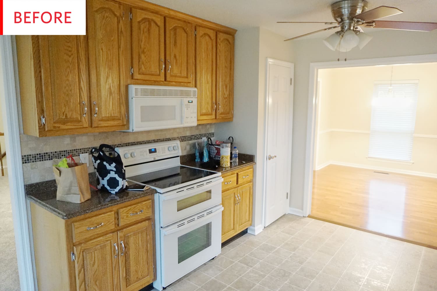
These classic ’90s honey cabinets are about to get a major makeover, and those tiny backsplash tiles are not long for this world. And while there might be subway tiles involved, this is definitely not one of those wall-to-wall white remodels.
Here’s the backstory on this renovation and what the homeowner was going for:
Our ’90s kitchen had good bones but dark, dated features and oak cabinets that were begging for some color. Instead of ripping out the solid wood cabinets and neutral flooring, we worked with what we had to give it an eclectic, updated feel that fit with the style of the rest of our home.
Our home has an eclectic, neutral, cozy vibe, and the kitchen did not flow naturally with that style. It’s the room we spend the most time in, so we wanted it to reflect our style more than any other area of our home.
First, to head off any confusion, know that the Before and After photos were taken from opposite directions. Keep an eye on where the stove and sink are and everything will be clear.
Diana Horton of Dahlias & Dimes has done something special here, making this kitchen feel at once more modern and more old-fashioned. The green paint and floral wallpaper have a lovely relaxed feel, enhanced by the fact that the paneled cabinetry was maintained. But while paneled cabinets—especially those involving curves and arches—can seem aggressively ’90s, now that they’re painted, these feel wonderfully vintage. The gold hardware and pendant have the same effect: They’re not shiny, plastic-y, and ornate ’90s gold. They’re streamlined, muted gold with a bit of an industrial feel.
The floor is unchanged, and now that it’s surrounded by color and fresh white paint, it no longer seems so intensely, depressingly beige. It now acts as a lovely pale neutral that the paint and wallpaper can pop against.
Diana tackled this kitchen as part of the One Room Challenge that so many design and DIY bloggers have been doing. Here’s what it took to complete this project in the time allotted:
The complete project, breakfast nook included, took roughly three months. The total cost was around $2,000 including paint, wallpaper, light fixtures, and backsplash. With this being our second kitchen remodel, we felt confident completing all the work ourselves. The open shelves were our only setback because we were unsure of the weight of the wood on the tile. With a little reassurance from a contractor friend, we installed the shelves, the finishing touch and favorite feature of our kitchen.
The old white stove, fridge, and microwave look great here, as they make perfect aesthetic sense with the white backsplash, trim, and walls. And while stainless appliances can work with gold accents and hardware, sometimes it’s nice to stick to one metal.
The plant and two framed pieces of art add a touch of beauty-for-beauty’s sake, but even without them, the ceramics and glassware have major aesthetic appeal, and the stacks and rows of open shelving have a pleasing and cozy look. They’re rightfully Diana’s favorite part of the new kitchen:
The part of our kitchen that I love the best is our open shelving. They’re so practical and allows me to display art in our kitchen. The one thing I would do differently would choose a more neutral wallpaper. Though I love the print and colors, I can see myself growing tired of it sooner than later.
Now that the One Room Challenge is complete, Diana has some excellent encouragement to share:
Don’t underestimate your ability to tackle a kitchen project yourself. A kitchen remodel can be affordable if you think outside the box. For example, painting cabinets and adding affordable white subway tile can go a long ways!

