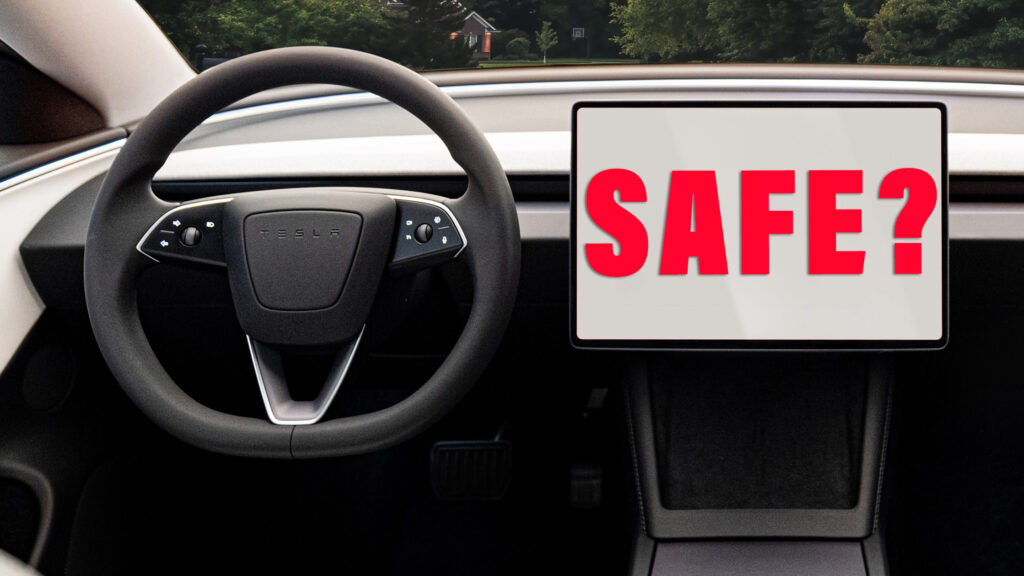
The use of touchscreen technology in cars is almost as polarizing as the gasoline versus battery debate. Some automakers still equip their cars with hard buttons as well as making you use a touchscreen to operate other features, but increasingly, new cars feature hardly any buttons.
window.ramp.que.push(function () {
window.ramp.addTag(“pwMobiMedRectAtf”);
})
And that shift has raised concern among safety advocates, including those at Euro NCAP, the Belgian-based organization famous for its crash tests and safety ratings. Starting in 2026, Euro NCAP will devote 5 of the 100 points available in its Safe Driving rating to the presence of “intuitive, easy-to-use vehicle controls,” and suggests it may increase the weighting given to this in future years.
What that means is that cars that don’t meet certain criteria, such as allowing the driver to activate the turn signals, hazard lights, horn, windshield wipers and eCall SOS feature without prodding the touchscreen will be unable to achieve a 100 percent score. And although there is no legal imperative for carmakers to achieve top marks in Euro NCAP tests, most are keen to keep the body’s test team happy because buyers pay attention to the results.
advertisement scroll to continue
window.ramp.que.push(function () {
window.ramp.addTag(‘pwDeskMedRectAtf’);
})
window.ramp.que.push(function () {
window.ramp.addTag(“pwMobiMedRectBtf1”);
})
Related: Which Car Has The Worst Infotainment System In The Business?

It’s easy to see why touchscreens have become so popular with both automakers and buyers. We’re all so familiar with the tech from interacting with our smartphones dozens of times every day, and from a designers’ perspective, getting rid of fussy-looking physical buttons makes for a much cleaner dashboard and console.
When you’re parked up, or sitting in a traffic jam, touchscreens are great. They’re also handy for things like locating a position on a map – who remembers trying to do that on a pre-touschreen Audi when moving the cursor first horizontally and then vertically was like a cross between opening a safe door and drawing a house on an Etch A Sketch?
window._taboola = window._taboola || [];
_taboola.push({
mode: ‘thumbnails-a-mid’,
container: ‘taboola-mid-article’,
placement: ‘Mid Article’,
target_type: ‘mix’
});
window._taboola = window._taboola || [];
_taboola.push({
mode: ‘thumbnails-oc-2×1’,
container: ‘taboola-mid-article-thumbnails-organic’,
placement: ‘Mid Article Thumbnails Organic’,
target_type: ‘mix’
});
But on the move they’re hopeless, requiring you to take you eyes off the road for longer than you’d need if the same function was operated by a hard button. And that’s if the road is smooth. Throw in some bumps and trying to tap that app icon can be like slotting your key in the front door after seven pints on a Friday night.
Thankfully many carmakers still spread functions between screens and real buttons and dials, and improving voice activation is helping. But some brands, like Tesla, are pushing the boundaries. The facelifted Tesla Model 3 now has no column stalks, the turn signals are on the steering wheel (annoying when you need to activate them when the wheel is turned), as is one button for the wipers, while the expanded wiper menu and gear selector are now located in the touchscreen (with inexplicably tiny buttons).
Given enough miles behind the wheel you’d get used to that setup, but that doesn’t make it good design, or safe. As a carmaker you can’t possibly claim to have made a step forward when you redesign a control so that it requires more thought or time to operate than it did before you started.
It feels like the over-stuffed touchscreen systems some carmakers are now producing would be great in fully autonomous cars, but the problem is those cars aren’t here yet, and won’t be for years. Or are we alone in finding cars like the otherwise excellent Model 3 frustrating? Do you think touchscreen tech has gone too far or are you happy to see buttons banished to history?
