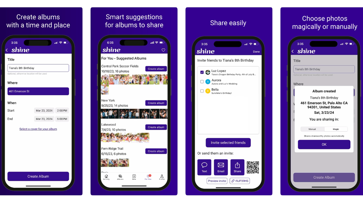
When former Yahoo CEO Marissa Mayer unveiled the promotional images for her new photo-sharing app, Shine, on Tuesday, I thought I was looking at one of the Facebook posts my elderly aunt has a habit of creating. But alas, the person posting was not my aunt, it was Mayer.
As explained by Mayer, the app aims to help people easily create and share photos of trips, parties, or hangouts with friends. Shine does this by creating shared albums, to which you and others can add photos in their original resolution. If you’re too lazy to go through the photos you’ve taken to decide which ones you want to upload, you can turn on the app’s AI-powered “Manual Mode.”
When Manual Mode is selected, Shine’s AI scans your photos, selects the ones it thinks are share-worthy, and asks you to approve the selection. Once you do, the app uploads them to the shared album. There is also a “Magic Mode,” where the AI automatically uploads selected photos to albums. If there are photos it’s not sure about, the AI asks you to review them, according to the app’s description in the App Store.
As someone who frequently forgets to send photos to friends and family, I think Shine has a good idea. Having access to photos in their original resolution is also a great call given that apps like WhatsApp can downgrade photo resolution. Sunshine, the startup behind Shine where Mayer is a co-founder, also appears to take user privacy seriously, stating on its website that it will never sell user data to third parties and does not run ads on its apps.
That being said, the app’s design looks like something from the early 2010s. It’s very clunky-looking and not at all like the apps we’re used to today. You can definitely tell the app is the brainchild of two former Yahoo execs—Mayer leads Sunshine with Enrique Muñoz Torres, a former senior VP of search and advertising at Yahoo—with the purple color scheme and the hippie-looking font.
I wasn’t the only one that noticed.
“Please, can you hire a designer? This app serves a great purpose but its visual design is shockingly bad and outdated,” Bryce Schmidtchen, who works on apps for the Vision Pro at Apple, said in response to Mayer on X, formerly known as Twitter.
Mayer acknowledged that this was an issue and told Schmidtchen to “Please send leads our way,” sharing a link to a job posting for a UI/UX designer.
Given Mayer’s response, it’s strange that she decided to launch Shine now when she felt that there was still room to improve the visual design of the app. Maybe Mayer wanted to get ahead of a competitor or simply test the waters to see if there was interest in an app like Shine. While those are good reasons to speed up a launch, the look of this app may have doomed it from the start.

