We independently select these products—if you buy from one of our links, we may earn a commission. All prices were accurate at the time of publishing.
Leslie’s client downsized into a home that was mostly perfect, save for the cramped and outdated kitchen. After doing some major switching around of cabinets and appliances and making some smart aesthetic upgrades, she was able to create a space with a much better flow that matched the rest of the home.
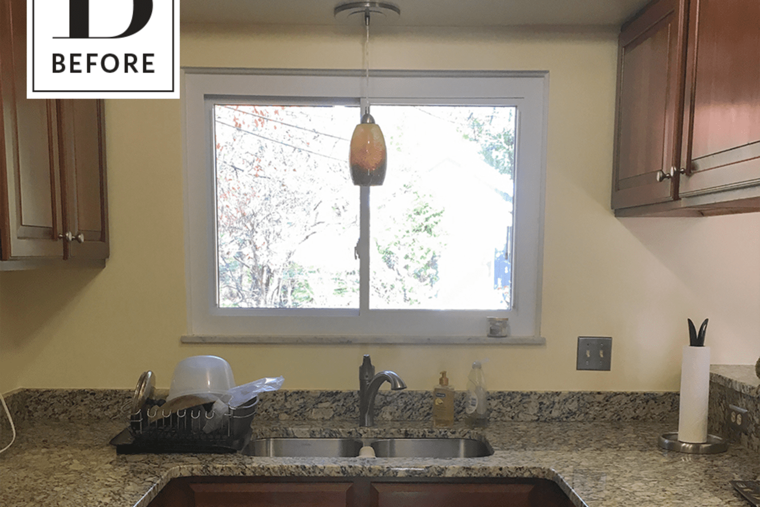
From Leslie: “My client had downsized from the house where her daughters grew up, to a mid-century split-level home across town. The house is a great fit except for her kitchen, which had been hastily updated for resale, which meant adding a cheap granite countertop and not addressing the kitchen’s small footprint and sort-of-open/sort-of-closed-off feeling. So with these less-desirable features in mind, and a couple other small design gripes, we aimed to create a truly updated room that was appropriate for the age and era of the house with improved flow and functionality. It was also important to incorporate my client’s personality and love for art into the space to turn the house into a place she felt at home. “
Her chief complaint was its size and how separated she felt from the living and dining areas. The floor and ceiling plans limited our outward growth of the kitchen, so instead we rearranged the cabinets and appliances to make the space more functional and give the appearance of more square footage. We did this by eliminating a pocket door and its casing to widen the entry, installing hardwood floors that matched the existing red oak and shifting appliance locations to eliminate door and user overlap.
The multi-height peninsula and soffit-hung cabinets were the major pieces that separated the kitchen from the other spaces and my client was sure she wanted them removed, a decision with which I agreed. We extended the base cabinets, installed a wall cabinet and used wood floating shelves underneath the ceiling pitch. This extended our storage opportunities without creating a strange match up of ceiling and cabinet box and brought in some natural warmth to the white cabinets and walls. We also shrunk the opening to the dining room to accommodate a pull-out pantry cabinet, which eliminated the need to use the linen closet around the corner for dry storage. We removed the soffits to gain more visual lightness and vertical storage and we finished off the tops of the boxes with simple flat trim and 1/4″ reveal. Lighting was also updated to LED recessed fixtures and fun midcentury style pendants.
I am so pleased that our carpenters were able to help us achieve a custom look with stock cabinetry. In order to tailor the style in a more modern direction, we chose flat panel doors, simple hardware and stainless steel appliances. But it was the ceramic art tiles my client had collected, most of them stored away(!), that drove the color story and many of the design decisions. A few had previously been mounted to the soffit and we decided they would be better showcased just above the backsplash. My client was also sure she wanted soapstone countertops and I suggested we add a panel behind the stove as a way to highlight the natural material as a piece of art itself. These choices created something of an art gallery effect, which blended seamlessly with the rest of my client’s wide and diverse art collection she has displayed all over her house.

