Sometimes, a new device makes you again consider what role technology plays in your life. The Samsung Galaxy Z Flip 5 did that for me.
Now, first off, I’m not saying Samsung has crafted something so revolutionary it’s turned the tables on smartphone technology. Far from it. Instead, Samsung has made me once again recognize the power of reflecting on how a device is used, by whom, and why. I’ve used the new Galaxy Z Flip 5 for close to two weeks. I have only enjoyed the latter half of my time with it.
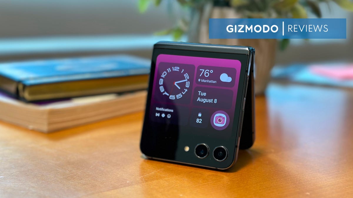
I spent the first week annoyed at the limitations of the device’s new exterior screen. The company bumped up the the Z Fold 4’s 1.9-inch exterior screen to a 3.4-inch AMOLED 60Hz display. Imagine all the convenience of a slimmed down phone with access to important apps. But while its simplified calendar and weather widgets worked fine for daily use, I was restricted from doing something as simple as accessing my favorite music app or photos without first opening the phone. Notifications worked fine, but I couldn’t respond to an email without first having to use two hands to crack the thing open.
But when I bootstrapped additional apps onto the exterior screen using Samsung’s Good Lock app, the change was immediate. I don’t religiously check my daily calendar, but I do regularly dive into my email or Slack messages for work. I don’t need to watch stock prices like a hawk, but I do want to access my music and audiobooks while on the go.
Samsung has put child locks on a few of the best features of a large exterior screen screen simply because the UI experience may not be perfect. That’s a shame, because with all its features enabled and its apps functioning on both screens, the $1,000 price tag for the Z Fold 5 is far easier to justify for folks with thin pockets, both physically and monetarily. By the nature of the folding form factor, you will need to give up other premium phone features found for the same price—including a high quality camera or merely a screen without a crease in it—for an extra bit of novelty.
Last year’s Z Flip 4 beefed up the hardware to be on par with Samsung’s other flagship phones, so much the better. In that vein, Samsung managed to create a phone with a considerable exterior screen upgrade without sacrificing much on performance, though we struggled to make it a full day with constant use before needing a new charge.
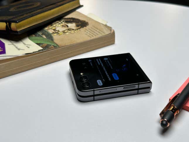
Ergonomically, it’s a comfortable device to hold folded up, even though the glass back is too liable to scratches for my tastes. The new hinge looks good, feels solid, and it does fold virtually flat, but you would need thousands of folds before seeing if the hinge holds up. It’s rated IPX8 for durability in up to 1 meter in water for 30 minutes, but that doesn’t mean it will survive dust given enough time to settle into its sensitive crevices. As with all other past foldables, only time will tell if Samsung has managed to truly eliminate squashable screens’ notorious long-term survivability issues.
The Extra Functions From a Larger Exterior Screen

The Flip 5’s new, larger exterior screen is the most striking change from last year’s iteration. Other than a hinge redesign and an updated processor, it’s practically the only major addition to the phone. Still, it’s more than just a gimmick. The extra screen fundamentally changes how people use the device. At a peak 1600 nit brightness and 306 PPI, it does the trick for basic, everyday use.
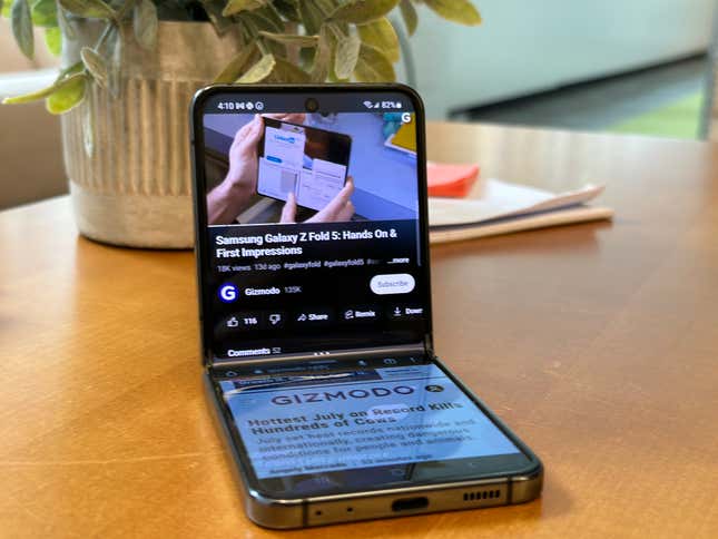
As I mentioned before, the few widgets available succeed at giving you as much information you need at a glance. You’ve got a handy weather, calendar, and step counter for some pseudo-smartwatch action. The keyboard used when responding to notifications extends to full-size, and it works well enough for quick text blasts. Unfortunately, the only way to enable apps on the outside screen is to enable them through the “Labs” section of Advanced Features in settings. There, you only have access to five apps, including Google Maps, Netflix, YouTube, and two other messaging apps.
There is a way to open up all the other apps. You have to dig into Samsung’s own app store to find the Good Lock app. Hold on, you’re not done. Then you have to navigate to the “Life up” section, find “I heart Galaxy Foldable,” find the launcher widget, and enable it. Now, there’s an additional folder on the exterior screen that houses all your apps. You’ll need to navigate to it each time to access those apps. It’s a pain, and to be honest, it feels infantilizing. Are there UI problems? Yes. There’s white space where there shouldn’t be and shrunken scrolling, but I would rather have the option to use my apps out of the box rather than having to jump through hoops.
If you want to compare, the Motorola Razr+ foldable with its 3.6” exterior screen allows you to have all the apps you want accessible on the exterior from the get-go. That flip phone also has smaller bezels on the bottom and sides of the screen that wrap completely around the exterior sensors. I did not personally spend enough time with the Razr+ to recommend it above the Flip 5, but as The Verge’s Allison Johnson points out, Motorola’s widgets leave something to be desired compared to Samsung’s renditions.

The 3.4-inch display plays directly into how the phone gets used. In a way, it’s a great way to change your phone habits. You can get some of the most important info quickly through the exterior screen, and you’re less incentivized to scroll endlessly on a smaller screen. I don’t have to open the phone to the tall, thin 6.7-inch FHD+ display nearly as often with all my apps enabled. That inside Infinity Flex Display has a better refresh rate at 120Hz and a Dynamic AMOLED screen, but if I’m not watching videos, I found I only wanted to unfold it to read an email or message on a bigger screen.
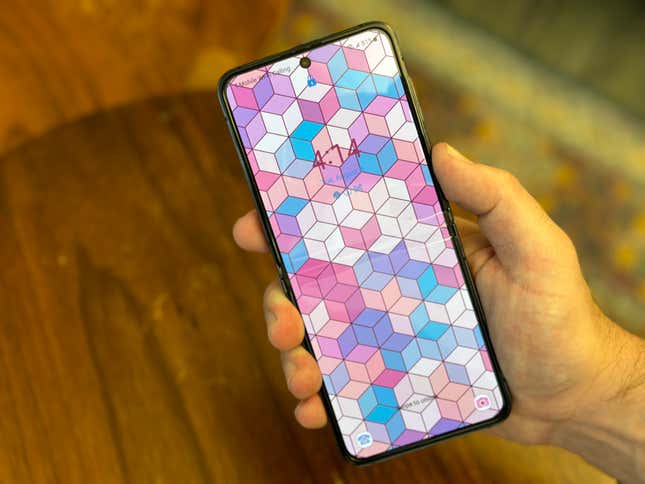
That’s not to say the inside screen is bad. It’s practically the same as the Z Flip 4, which was fine back then and is fine now. The crease is there. It’s not as deep or noticeable as the Google Pixel Fold, but it will still catch the light at inopportune times. The main display is thinner than a traditional phone, which is especially noticeable when using a squished keyboard. At 6.9mm, the phone feels slightly thinner than I’m used to in its unfolded state, and just slightly thicker at 15.1mm when it’s shut tight.
The hinge design feels fine, and I haven’t had any issues with it in the time I spent with it. The opening action isn’t stiff, but unfolding the device does take two hands. That’s why having all those apps available on the exterior screen is so necessary for actually enjoying the Z Flip 5.
The Flip 5’s Camera Has Fun Selfie Features
There is nobody on earth who would describe me as a selfie guy. I have a fading widow’s peak that’s as sharp as Aang’s head tattoo from Avatar: The Last Airbender, and I rather think I look much better standing several feet from the camera where I can make obscene facial expressions. Samsung is marketing its phone to the influencer class with unique selfie, photo, and video features, but those capabilities are lost on a guy like me, and overall, the phone features a less-capable camera than other $1,000 devices.
The dual camera array on the Z Flip 5 includes a 12 MP ultra wide and another 12 Dual Pixel wide lens. On the inside, you’ll find a 10 MP selfie camera, but you’ll rarely, if ever, use it for anything but video calls. With the larger exterior screen, the Z Flip 5 lets you take selfies without needing to crack open the phone. You can also take photos and videos by holding the phone like a camcorder. With a single button, the people you’re videoing can also see what you see. This makes group shots a hell of a lot easier than crowding everybody around a selfie stick.

But other than that, the camera itself is nothing to write home about. It’s the same exact setup as the Z Flip 4. The photos I took with the device were detailed enough for the common photo taker, but I occasionally experienced washed out interior photos using the default settings. The colors were very sharp in natural light, and I was surprised by the amount of detail you can get even in cloudy, muggy settings, especially with portrait mode. The built-in photo filters also produced some interesting, semi-artistic pics.
That being said, there’s no telephoto lens here or anything that shoots above 12 MP. It’s fun to use, and most Flip 5 owners may barely notice the difference in quality to their current phone made in the past three years. Still, the $1,000 you spend on a Flip 5 could go to a Google Pixel 7 Pro or an iPhone 14 Pro, both of which sport much better camera arrays than the Samsung foldable.
The Flip 5 is Slightly More Powerful Than the Flip 4
With an extra screen, the next big issue for the Flip 5 is its battery life. With a 3,700 mAH dual battery, I could make the phone last from 100% at the start of the day to about 10% to 20% in the evenings with constant use, including a few video shoots. I didn’t get to perform a full battery stress test in my time, though we will update this review once it’s done. The battery capacity is only slightly bigger than the Z Flip 4’s 3,595 mAh, so a Flip 6 should really start thinking about a better battery, or at least far more optimizations.
The Galaxy Z Flip 5 is running the Qualcomm Snapdragon Gen 2, the same chip powering Samsung’s other high-end flagships like the Galaxy S23. The Flip 4 ran on a Snapdragon Gen 1+, which itself a quality processor, but the Flip 5 simply outclasses it. Our own GeekBench 6 benchmark tests show the latest Flip easily outclasses the last generation foldable on both single-core and multi-core. The Flip 5 scored equivalent to the S23 on both single- and multi-cores.
Still, the Flip 5 is nowhere near where Apple is, thanks to the fruit stand’s ultra-optimized proprietary tech. The iPhone 14 Pro scores a 2551 on single-core and 6421 on the multi-core settings. The GPU benchmark on Apple’s device was more than twice what the Z Flip 5 could do.
On the browser end, the phone received a WebXPRT 4 score of 177. The device only has options for 8GB of RAM with either 512GB or 256GB of internal storage, but an iPhone 14 Pro can get just under 200 on the benchmarking tool with its base 6GB of RAM.
A Few Extra Features

The Galaxy Z Fold 5 is the device you should look to for multitasking capabilities, but Samsung does allow a few split-screen capabilities on the Flip 5 as well. When in “Flex Mode” with the phone sitting at an “L” shape, certain music or video playing apps like Instagram will show controls on the bottom panel. The aspect ratio isn’t great, but it’s there for those who want it.
Other apps also work in this mode as well, and will instead show a large Touchpad for controlling the top screen with a mouse cursor, if you really want to. Using some of the bottom portion controls, you can also run two separate apps concurrently on the top and bottom screens. I’ve yet to find any use for this beyond quickly pulling up Slack while letting YouTube play concurrently, but it’s there for those who emphasize multitasking even beyond risking eyestrain.
I think I could get used to a small screen experience. I wouldn’t catch myself doom scrolling as often as I do, and I would always have the larger screen on nearby when I have two hands free. Overall, I could imagine myself using the Z Fold 5 full time, but the pointless app restrictions makes me start consider Motorola’s alternative as well. I hope that Samsung takes the child locks off at some point so I can place apps right in the widgets panel without needing to select from a folder. This is Android, after all, so perhaps we’ll either see Samsung or some other developer come to the rescue. Until then, I’d be hard pressed to eat that $1,000 price tag.

