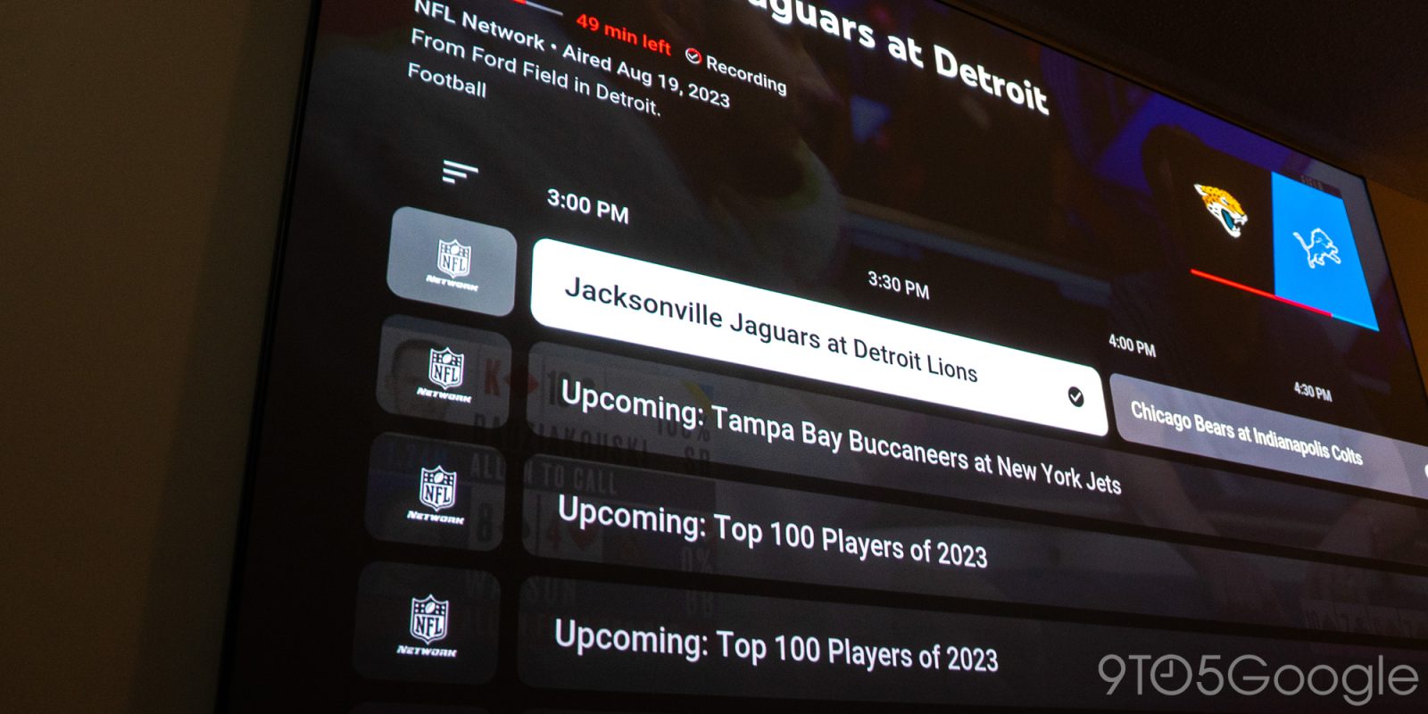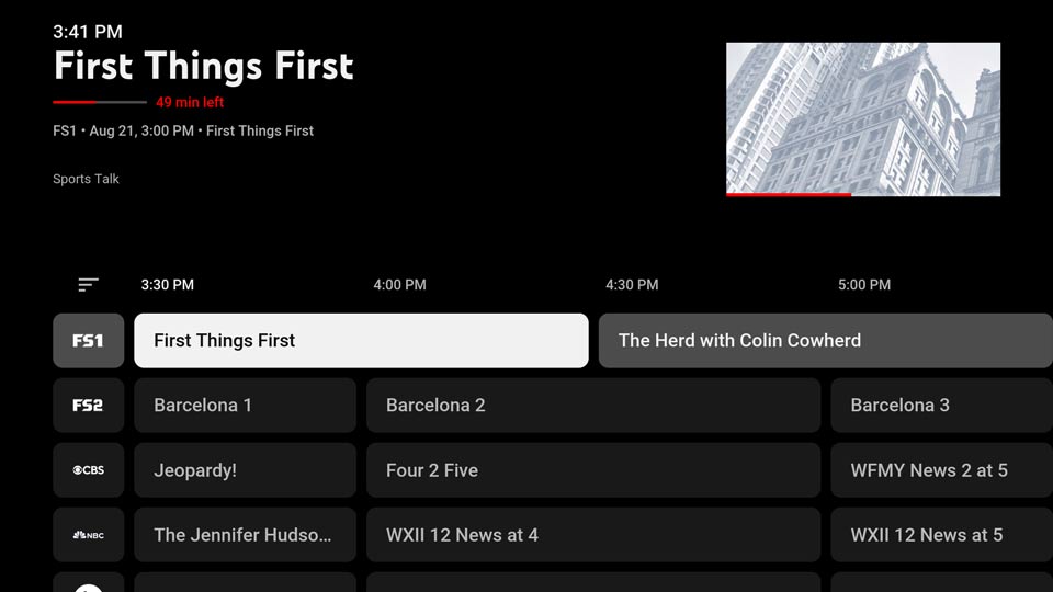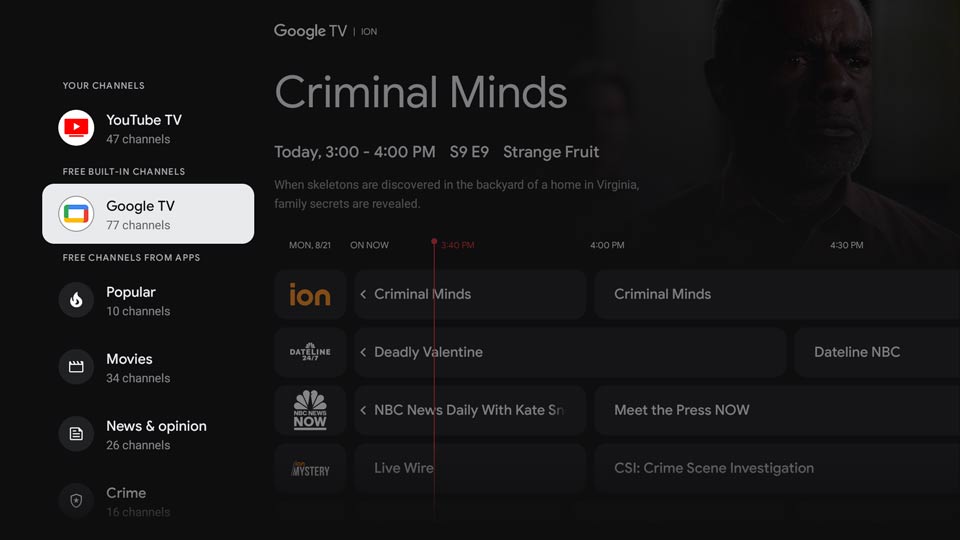
A newly designed Channel Guide is rolling out to the YouTube TV app. The new look brings a cleaner look that aligns with Google TV’s Live tab.
Toward the end of April, Google TV rolled out a new feature that allowed users to view free built-in channels all from a new “Live” tab in the OS. That new tab brings additional channels beyond the ones included with Google TV, depending on what apps are installed. Installing YouTube TV, for instance, will inject your favorite channels into that page, meaning you never have to open the app.
As the new Live tab in Google TV came with a fresh design, Google has been working on UI continuity. Spotted by users on Reddit, YouTube TV has a refreshed Channel Guide page with clean tile designs that look exactly like what is offered in Google TV’s Live tab.
The look is reminiscent of other Google products, like Android Material You designs we’ve seen before. Each channel tile has new radial edges that give the guide a refreshed look. The background also seems to be a bit darker than previously, making it easier to read live and upcoming shows.
The new look isn’t part of a massive overhaul, but it’s reminiscent of a changing design language from Google in both Google TV and YouTube TV. It’s also one of the biggest changes to come to YouTube TV since the addition of picture-in-picture playback. Going forward, it wouldn’t be unexpected if YouTube were to take on much the same subtle design cues in its video pages, though this current change looks to be limited to the “live” aspect of YouTube TV and Google TV.
FTC: We use income earning auto affiliate links. More.


