We independently select these products—if you buy from one of our links, we may earn a commission. All prices were accurate at the time of publishing.
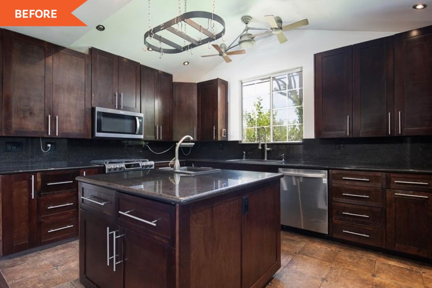
Designer Julia Newman of Julia Adele Design worked with her Long Beach, California, clients to transform their previously “cave-like” kitchen and dining area into spaces that would better serve their family on a daily basis. Sure, the hybrid room was large, but the cabinetry was dark and heavy and didn’t reflect the aesthetic of the home owners at all. The layout, while open, also felt disjointed. So in addition to improving the look of the rooms, one of Newman’s chief goals for the project was to better delineate the kitchen from the dining space.
“The footprint of the existing kitchen was generally fine, except it had one side that was completely open,” she explains. “In open floor plans, it’s important to get creative in designating spaces.” The solution? Adding a peninsula, which isn’t always preferred to islands in larger kitchens. This strategic move though, Newman says, “not only helped denote the kitchen from the dining space, but it also added extra storage and convenient seating for kids on the go.”
When selecting materials for the space, durability was the name of the game, but finding fixtures and finishes to brighten up the space and draw in natural light was another consideration. This had to be done without altering the windows in any way, which Newman says was a challenge. She started with the flooring first. “The tile in the kitchen felt dated, and the wood flooring was so dark that it ate up much of natural light,” she says. “In the end, we chose vinyl for its durability and clean-ability in lighter variegated shade to brighten the home up and provide a natural feel.”
Once the flooring was in, Newman and her clients could focus on the fun stuff: the cabinets and countertops. Falling in love with a specific countertop material — Gabana quartzite — shaped many of the other design decisions to follow in the hybrid room. “White felt like too much maintenance for a home with small kids,” Newman says, explaining why this particular stone was so appealing. “This material can withstand a lot and still look new.” She also adds: “The colors in it were light enough, and the polished finish helped reflect the natural light coming through the windows.”
Newman selected a putty-like color for the Shaker-style cabinets to complement the countertop choice. “White cabinets can be hard to maintain, and with a kitchen this big, it can look stark,” she comments. “I wanted to bring in some warmth.” Meanwhile, though, an off-white backsplash and farmhouse sink, both chosen in a high sheen, help throw light around the space, Newman explains. Brass faucets further warm up the room. To finish things off, Newman opted for pops of black for the counter stools, dining chairs, and cabinet hardware. These hits of black ground all the lighter shades and add a little bit of edge.
Now Newman couldn’t be more pleased with the finished kitchen and dining room combo. “Making a family home for us means creating a space that can grow with the family and can evolve with their needs,” she says. “For example, now the peninsula is a great spot for small kids and high chairs. In a few years, it will make the perfect homework spot.” Better yet, the revamp has made entertaining easier for Newman’s clients. She adds, “This project transformed this space into a home and a place that the family can gather. ”

