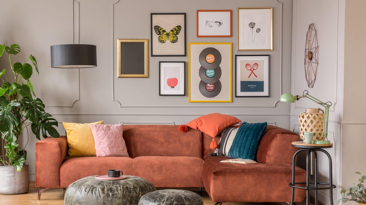
Even if you spend hours scrolling through Instagram posts featuring expertly decorated homes, that doesn’t necessarily mean you know how to bring those design elements into your own home—or where to start. For many people, that entry point is creating a gallery wall: A collection of (usually) framed art, photos, ephemera, and other objects, arranged together on a section of a wall.
As far as home DIY projects go, creating a gallery wall is something that most beginners can tackle. At the same time, it does require some planning and thought in order to look cohesive and intentional. Here are a few common mistakes to avoid along the way.
Avoid these common gallery wall mistakes
Whether you want to create a focal point in a room, display a collection, make your home more personal, or all of the above, a gallery wall could be the answer. But before you start nailing things to your wall, let’s talk about some common mistakes to avoid:
Doing anything you can’t undo (unless you’re sure about it)
Filling in and painting over nail holes in a wall isn’t difficult, but do you know what’s even easier? Not having to do that in the first place. Take measurements and make some sort of a plan to ensure that everything fits in your wall space.
Ideally, you should be able to switch up your gallery wall without too much hassle—especially if you have more items you’d like to display than you have wall space. (That way you can rotate.)
If you have one large, heavy object that takes extra effort to attach to your wall—effectively making it somewhat permanent—make that the anchor piece, and arrange the rest of the gallery wall around it.
Prioritizing style trends over your personal taste
Let’s flash back to the early-to-mid 2010s for a minute. If you were looking for gallery wall inspiration on social media or walked into a Home Goods, you may have noticed a vast array of decorative signs with phrases like “Live Laugh Love,” or words like “Gather” or “Farmhouse,” or photo frames with wooden cutouts that spelled “Family” attached.
If those spoke to you, and you wanted to include them in a gallery wall—where perhaps they remain today—there’s nothing wrong with that. You do you. However, if the signs and words aren’t weren’t your cup of tea, then I hope you ignored that trend and instead, filled your walls with pieces that reflected your personal taste and made you happy. Either way, you can also always change your mind and switch things up.
It’s too spaced out
When it comes to gallery walls, spacing is key. Pick a dedicated section of a wall and stick to it. If you start hanging framed art and photos in spots randomly scattered across the entire wall, it won’t look cohesive or balanced.
Making something boring
Gallery walls really pop when there’s visual interest. For example, if you use frames that are all the same size and color, and line them up neatly in rows, it may not be that interesting. On the other hand, if you use frames in a variety of shapes, sizes, and colors, accompanied by art and other objects featuring different textures and dimensions that are arranged together and spaced well—but not in a grid—it’ll likely draw and then hold your attention longer.
Of course, it’s your home, so if you like the look of uniform frames in a grid, go for it. But if you create one like that and then realize that something looks a little off, this might be the reason.

