A 5-minute speech can feel both incredibly short and infinitely long.

While this short format encourages audiences to pay more attention, presenters often struggle to fit everything into five minutes even as they navigate nervousness that seems to stretch out each second.
As a result, preparation is key for 5-minute speech success.
But how can you ensure your presentation accomplishes everything it needs to within just five short minutes? We’ve put together an (appropriately condensed) guide on five-minute presentations to help you get started.
How many words are in a 5-minute presentation?
A five-minute presentation is approximately 700 words long. The average person speaks 120 to 160 words a minute, which means the average five-minute presentation is 600 to 800 words.
To calculate your own personal speaking speed (words per minute, or WPM):
- Make an audio recording of yourself speaking for one minute.
- Use a free transcription service to generate a text version of your speech.
- The number of words you spoke in that minute is your personal WPM.
When constructing a longer presentation, you might be more concerned about transitions and keeping the audience engaged with more extensive narrative elements.
In a short presentation, everything you say should directly tie back to your central premise and further advance your main point.
Keeping a tight scope and using your words carefully ensures your time isn’t wasted and the audience leaves with a clear, singular takeaway.
How many slides are in a 5-minute presentation?
Five or six slides, or about one per minute, is a good baseline for a 5-minute presentation. Depending on your subject matter, however, you might use up to 20 slides and spend about 10 or 15 seconds on each.
More important than your slide count is what each slide contains. It‘s a good rule of thumb to keep your slides simple and focused on visuals instead of text for a presentation of any length.
This becomes especially important when you’re dealing with a condensed presentation window.
Trying to cram in as much information as possible within a short time frame can be tempting. Resist the urge. Instead, focus on simple, clean visuals that all tie back to your central premise.
You can also use these free presentation templates to arrange your slides in a way that makes the most sense for your delivery and the content of your presentation.
5-Minute Presentation Outline
To help you get started, we’ve created a basic outline below that you can use to organize your initial thoughts in the planning stage.
Ideally, your slides should answer four key questions: What, why, how, and what comes next?
1. Cover Slide (What)
Your cover slide needs to answer the question that’s on everyone’s mind: What’s in it for me?
Specificity is your friend. For example, if you’re delivering a presentation on improving writing skills, avoid titles such as “How to Refine Your Craft.”
Instead, opt for titles such as “Five Tips to Improve Your Writing Skills” or “A Quickstart Guide to Creating Better Written Content.”
A clearer title helps your audience understand the focus and prevents you from going too broad with your topic.
2. Thesis Slide (What, Continued)
Your second slide should be a clear thesis statement. This is what you want listeners to take away from your presentation and remember tomorrow when they’re back at work.
Writing a thesis benefits both your audience and you. Establishing a one-sentence summary of your presentation forces you to articulate and focus your message, which will help you craft the rest of your slides that support this point.
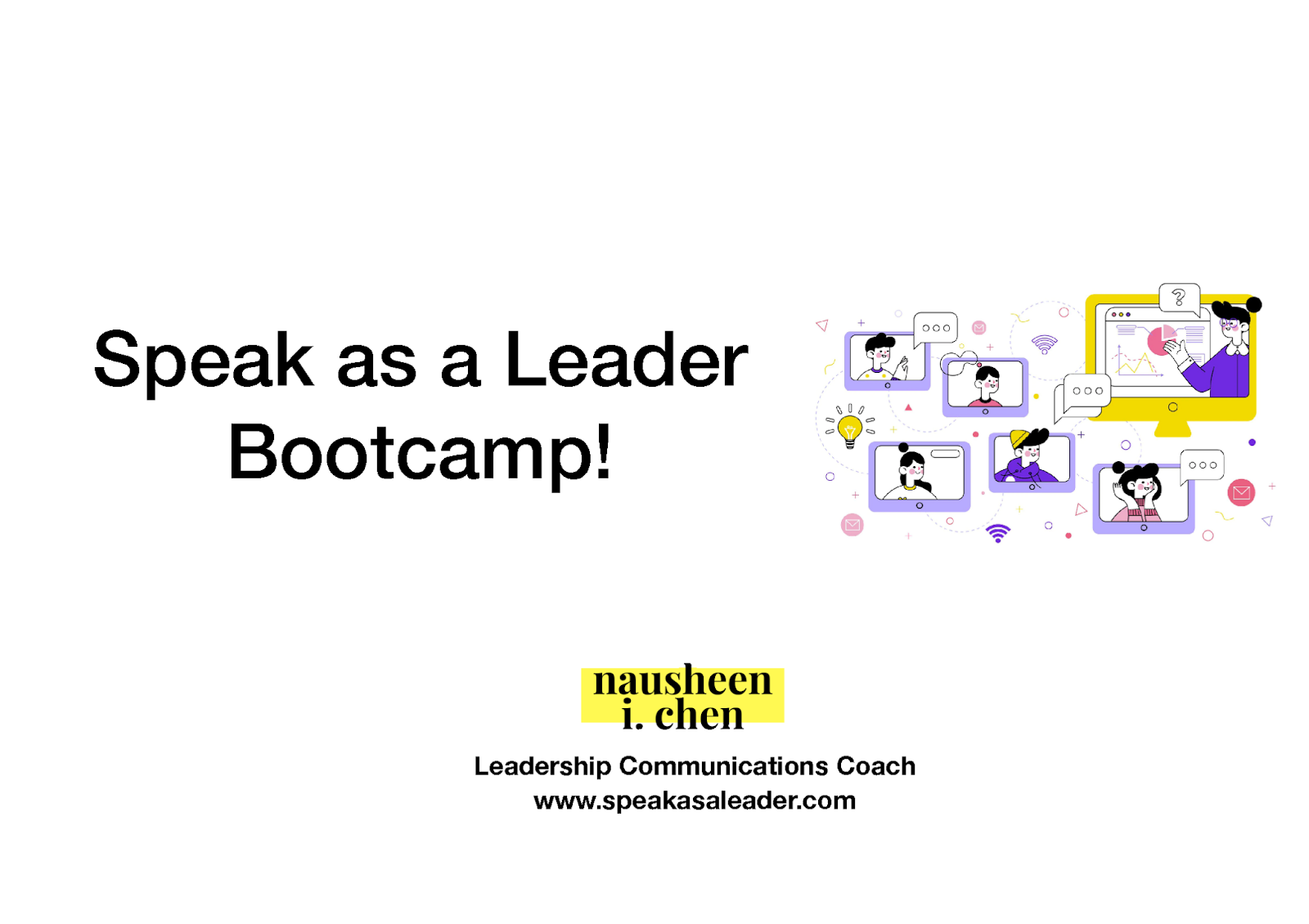
To write your thesis, “Start at the end and ask yourself what you want to accomplish in 5 minutes,” said leadership communications coach Nausheen I. Chen.
“Keep it super simple: the fewer the goals of the presentation, the higher the chance of you achieving them.”
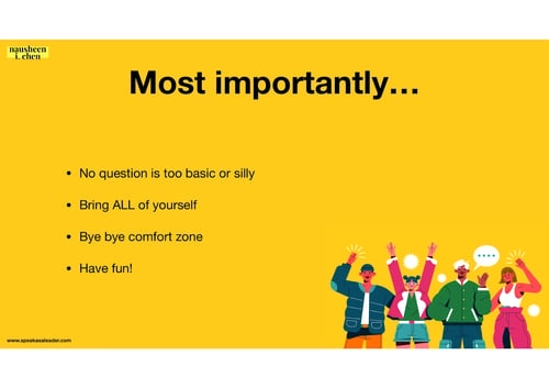
In Nausheen’s five-minute presentation, she explicitly states the most important takeaway for viewers at the beginning of her presentation:
3. Problem Slide (Why)
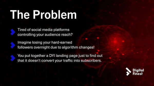
Once you’ve established what, talk about why. This is the problem that needs to be solved or the issue that needs to be addressed.
In our writing presentation example above, the problem could be that written content isn’t driving engagement — or is creating a negative user experience.
Speaking of negativity, don’t be afraid to frame your problem in a negative light. Audience members will be more motivated to listen if you steer them away from a problem, rather than helping them achieve a better outcome.
Think of this as “pain over gain.”
Here’s an example of a short presentation on the benefits of quitting caffeine:
- Gain — you could ultimately have more energy by quitting caffeine.
- Pain — your caffeine intake is hurting your energy levels, not helping.
After you’ve identified the problem, deliver the solution.
4. Solution/Analysis Slide (How)
Now that your problem has been introduced, tell your audience what they need to know about this topic. In shorter presentation formats, you’ll want to focus less on the details and more on the big-picture items.
Ask yourself: What does your audience need to know about this topic? Anything that falls into the “nice to know” category can be cut and delivered to stakeholders in a follow-up email after the meeting.
5. About You — Optional (Who)
Does your five-minute presentation need an “about me” slide? Only if it reinforces your thesis and gives authority to your words.
For example, a short presentation about cancer screenings would be more credible if a doctor was the presenter.
However, given the brevity of your presentation, you can find a creative way to lend that same authority to what you’re saying without shortening your message.
It might be possible to achieve the same authority by a doctor wearing a white coat for a presentation in real-life and adding the “Dr.” prefix to their name on Zoom.
6. Conclusion (What’s Next)
The conclusion slide allows you to coherently end your presentation and summarize the important takeaway points for your audience.
Don’t skimp on your conclusion just because it’s a short presentation — it’s the last thing your audience will hear from you.
On this slide, include contact information so interested audience members can follow up. Reinforce the points you presented and ultimately make your presentation more memorable.
5-Minute Slide Decks
We weren’t in the room when these presentations were originally given — and therefore can’t confirm with 100% certainty that they ran for only five minutes.
However, these decks clock in at under 16 slides and use a simple format to convey a problem and solution.
Oracle Cloud
In only 10 slides, this deck explores the benefits of Oracle Cloud. When crafting your presentation, remember that data can speak more with words. You can communicate a powerful point with a simple statistic, helping you move through your presentation quickly.
Accenture
There’s no need to give a comprehensive history or timeline. Your slides can do the talking. In this presentation, Accenture shows a timeline-style plan of how teams use OSDU to accelerate innovation.
Instead of discussing each point in depth, you can signal the most important milestones. Those who are interested can revisit the slides after your presentation.
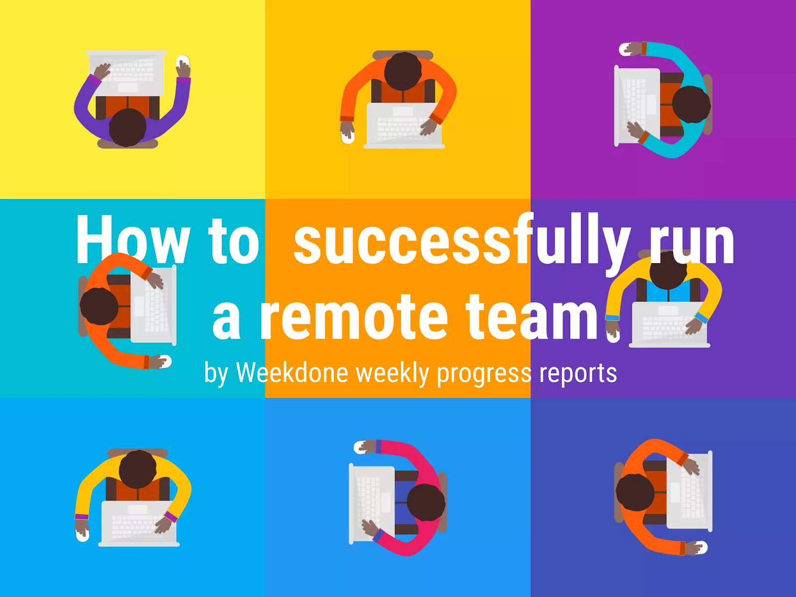
Weekdone
When it comes to words, choose wisely. Your slides don’t need to be packed with complete sentences. Your audience likely won’t have time to read it all in five minutes.
This presentation from Weekdone focuses more heavily on data visualization and illustrations. The number of words on the screen is limited. The listener is then more likely to focus on your speech instead of trying to read slides.
How to Create a 5-Minute Presentation Your Audience Will Love
Here are some best practices to follow when crafting a short presentation.
1. Make it about your audience.
A presentation may feel like it’s about you, but it’s actually about your audience.
“To know how to create a real transformation in a short amount of time, you need to know who you are speaking to and have a sense of what they know and don’t know,” said Learning Experience Designer Lyssa Leigh Jackson.
Lyssa encourages presenters to clearly define what their audience will walk away knowing and feeling.
2. Make specific points.
It’s easy to become overambitious or overwhelmed by the information you want to present. Choosing a single idea to focus on gives you clarity when designing your speech and allows you to cut extraneous details. It also provides a narrative structure that your audience can more easily grasp.
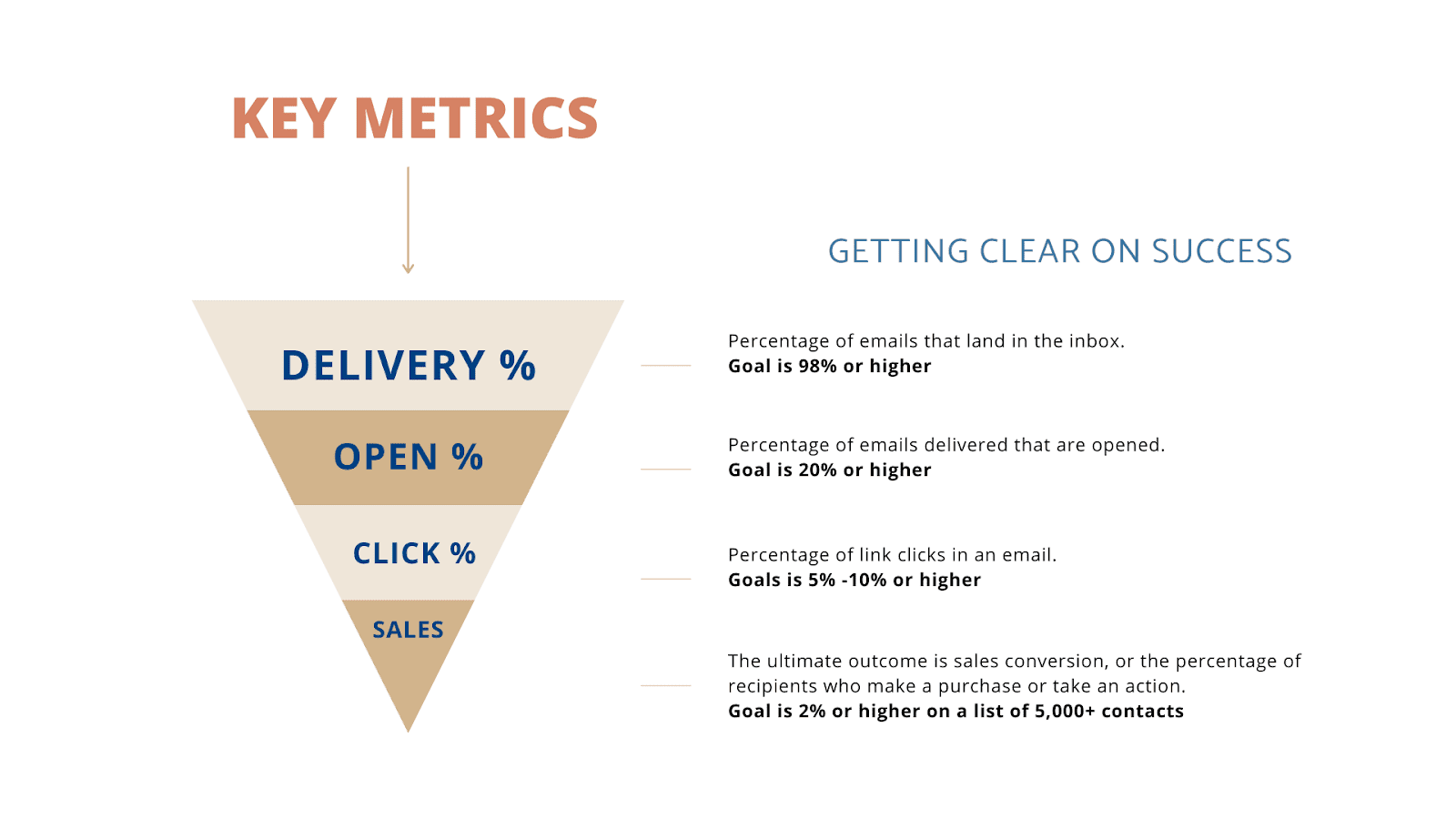
One of the most frequently made mistakes with short presentations is being vague. Malcolm Lewis advises you to combat that by leveraging data: “Get specific with examples and numbers. Be as precise as possible.”
This presentation slide from Lyssa Leigh Jackson explicitly writes data and also visualizes it with the funnel graphic:
3. Research, fact-check, and do it twice.
Your presentation is your chance to shine — but the shorter format also means that each point you make will be more visible, memorable, and, consequently, more vulnerable to scrutiny.
Take the time to thoroughly research the subject of your presentation and ensure every point you make is:
- Technically accurate.
- Tailored for your audience.
- Jargon-free and easy to understand.
With a strong command of your subject matter, your delivery will also be more confident and convincing.
4. Appeal to how people learn best: stories.
A story can give meaning to your presentation and elevate it to more than just facts, figures, and flashy slides. Building your presentation around a simple, easy-to-understand narrative makes your content more digestible.
Your presentation will only last for a few minutes, but stories naturally help humans understand and retain information more easily. Make sure to keep your story short, focused, and to the point.
5. Practice, practice, practice.
“Short presentation” doesn’t mean “spontaneous presentation.” From CEOs to interns, everyone will benefit from practicing their short presentations in advance, no matter how confident they are.
Practicing your presentation will help you:
- Remember your talking points.
- Reliably hit the 5-minute mark.
- Increase your overall confidence.
Film a run-through of your presentation on your phone and watch it back to help you self-critique.
Try to deliver much (or all) of your presentation by heart. Your delivery will be more natural, allowing you to develop a stronger connection with your audience. And once nerves hit, you’ll have the muscle memory to fall back on and carry you through the presentation.
If you need to speed through your slides to squeeze everything into a five-minute window, you’re likely trying to do too much.
6. Relax, and don’t rush.
In addition to working out timing issues, practicing will also help you feel less nervous in the moment and maintain your normal WPM.
It’s natural to speak more quickly when you’re public speaking, but prepare enough to feel relaxed throughout your presentation so that you don’t speed through your talking points.
Staying focused on your presentation (and not getting distracted by nerves) will improve your delivery and give you more confidence, even if you’re anxious about public speaking.
7. Expect your presentation to be shared.
Every presentation should be created with the expectation that it will be viewed on its own.
It’s standard practice to follow up presentations with an email that includes an attached slide deck. That email might be viewed by someone who missed your initial meeting or forwarded to someone new altogether.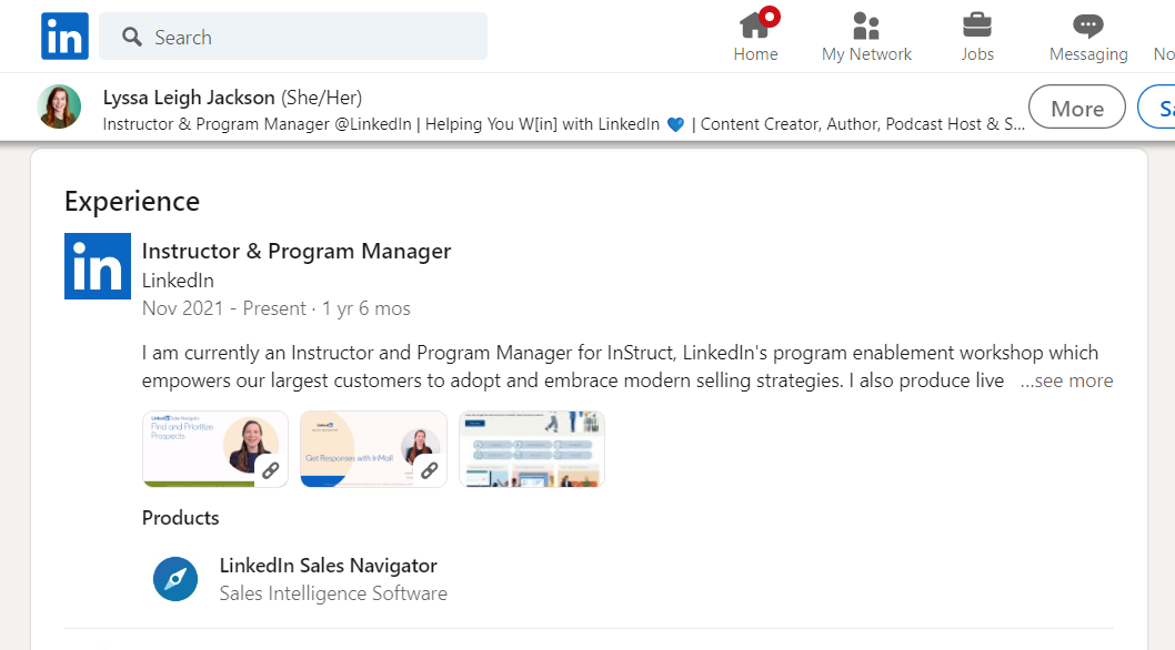
For this reason, don’t put sensitive or private information on the slides. Make sure that each slide presents enough information for viewers to understand the big bullet points of your short presentation.
This positive trend means your work can live beyond the initial presentation. Consider sharing the link yourself on your LinkedIn profile to highlight your work.
5-Minute Presentation Examples
These five-minute presentation samples explore different presentation settings and narratives that will help inspire you as you create your own presentation.
1. Speak as a Leader Bootcamp Welcome
This five-minute presentation by Nausheen I. Chen perfectly balances minimalism with informative text. The design uses background color to help create contrast within the presentation, and the final call-to-action is unique and actionable.
What we like: This slide deck is for a more interactive presentation, providing clear objectives and structure for the audience to follow along and feel comfortable. The value they can expect from the presentation is communicated and delivered.
2. Digital Finest Pitch Deck
This high-contrast five-minute presentation design by Gabe Marusca uses color to tell a story and bold text to engage the audience.
Where some presenters would’ve put an “about me” slide at the end, Gabe kept the spotlight directly on the viewer by showcasing client success testimonials.
What we like: This slide deck follows the classic problem–solution–results storyline. His conclusion slide summarizes the main point and provides a clear takeaway for audiences.
3. Women in the Workplace Briefing
This presentation grabs viewers’ attention immediately with powerful statistics and continues to articulate talking points with data.
While the presentation likely didn’t discuss every graph and data point in-depth, it paints a persuasive picture. This creates a highly valuable resource even when viewed independently of the presentation.
What we like: This data-driven slide deck illuminates problems women face in the workplace, with only two slides proposing solutions at the end.
If the goal of your presentation is to wake your audience up to a problem that’s in their hands to fix, follow this example to drive your point home.
4. Legacy Speaker Tour
This colorful presentation by Jasmin Haley uses bold text and engaging imagery to introduce a one-day workshop.
The inspiring message and colorful design reflect the energy of a live workshop, and the minimal text complements the bold imagery on each slide.
What we like: This is an excellent example of an image-focused presentation. If you want the focus to be on you as the speaker, with the images amplifying your message, find fitting images to accompany you point by point.
Making the Most of 5 Minutes
A five-minute presentation is over before you know it. By putting in the time and effort beforehand, however, you can make the most of five minutes to connect with your audience and give them something they’ll remember.
In practice, this means creating specific, targeted slides accompanied by succinct talking points that quickly and clearly provide answers for what, why, how, and what comes next.


![→ Free Download: 10 PowerPoint Presentation Templates [Access Now]](https://no-cache.hubspot.com/cta/default/53/2d0b5298-2daa-4812-b2d4-fa65cd354a8e.png)




![Blog - Beautiful PowerPoint Presentation Template [List-Based]](https://no-cache.hubspot.com/cta/default/53/013286c0-2cc2-45f8-a6db-c71dad0835b8.png)