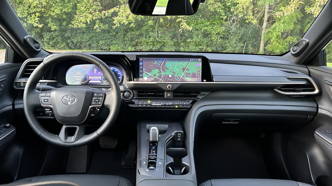
The 2024 Toyota Crown is just plain odd-looking from the outside, particularly with its available two-tone paint job option. You’re either going to love it or hate it at first glance, which is arguably commendable because Toyota didn’t exactly take chances with this car’s predecessor, the Avalon. However, the Crown’sd interior is decidedly not weird. For better or worse, Toyota chose a path of normality for its new flagship sedan’s insides.
That’s not to say the Crown doesn’t offer a tiny bit of intrigue from the first glance. In our Platinum trim (top trim) tester, Toyota carries the gold of the exterior over into the piping and trim accents of the interior. Sure, the only interior option is black leather, but at least there are gold accents to make it slightly more visually interesting than a Camry. The disappointing lack of interior colors on the top trim does hurt, though. If you want the Hybrid Max powertrain – a superb and powerful hybrid 2.4-liter turbocharged four-cylinder setup – the only option is black. Meanwhile, the middle Limited trim offers white, brown (shown below) and black options, all in leather. What gives, Toyota?
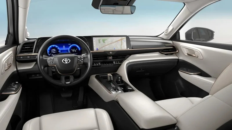
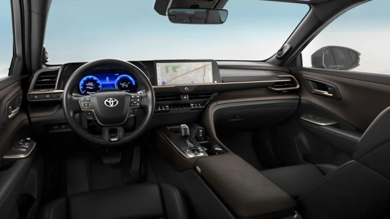
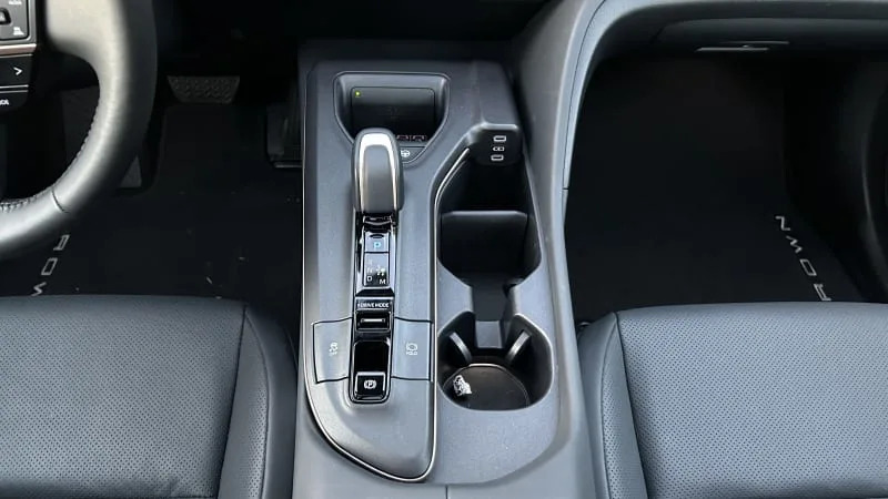
The interior design itself is the opposite of flashy, but it’s quite functional and exudes a quiet premium feeling that fits the Crown’s hefty price tag. And while the materials quality is fitting, it doesn’t go above and beyond like the discontinued Avalon did with its pretty colors, stitching leather and budget-Lexus aesthetic. A restrained use of piano black plastic throughout should be a boon for long-term cleanliness and niceness, though. Its center console features a lovely, vertically oriented wireless phone charger that secures the phone in place and makes it easy to lift in and out. The little nub of a shifter is the same monostable design that has been trickling throughout the Toyota/Lexus lineup since the new NX. Its functionality is the same as what was found in multiple Prius generations, and doesn’t take up too much space or ergonomically get in the way of anything. Often-used controls get surprisingly large buttons to the rear of that shifter, and a pair of large cupholders slot in on the right side of the console. The pair of USB Type-C outlets are in a convenient spot for both the passenger and driver to easily plug in if need be, too. Overall, the layout is logical and works well in practice.
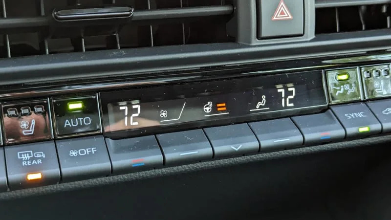
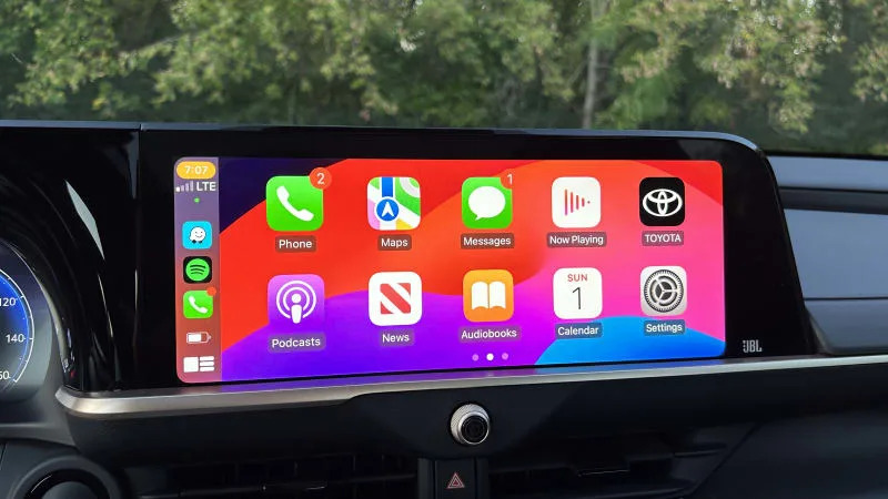
The same can be said for all the climate and steering wheel controls. Thankfully, Toyota has refrained from putting all the climate controls into the big touchscreen, so they’re still super-easy to adjust, down to the heated/ventilated seats and heated steering wheel controls. The volume knob is a little odd sitting right in the center, but it’s a pleasure to use nonetheless.
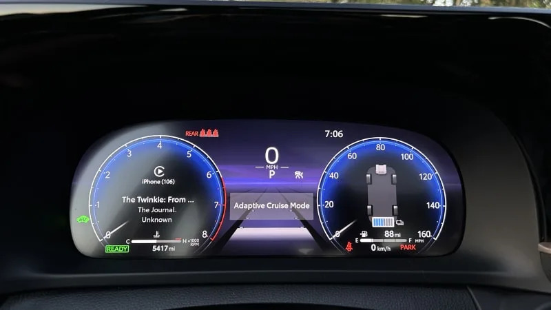
As for the big wall of screens, the main infotainment touchscreen runs Toyota’s latest infotainment software that has its pluses and minuses. The responsiveness and UI make it nice to tap and scroll through. However, we wish there were some hard buttons that would allow easier transitions between smartphone mirroring and the native infotainment, as it can be a tedious process to switch back and forth. The digital cluster itself offers a good amount of screen customization that’ll ensure you’re able to put the information in front of you that matters most. Plus, the combination of buttons and toggle switches on the steering wheel makes for easy adjustments without diverting your attention from the road ahead.
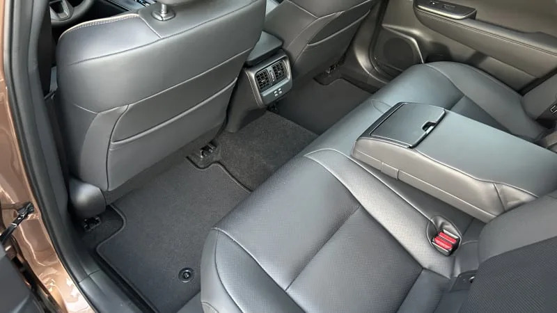
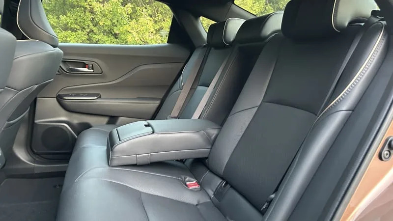
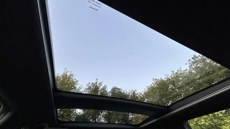
Backseat passengers will be lounging and relaxed, but the situation isn’t quite as boundless as the outgoing Avalon. At least you get dedicated vents and a pair of USB Type-C ports to stay charged in the rear. Plus, the large panoramic sunroof makes the sloping roofline feel a little less confining when open to the sky above. One downside to the roofline, however, is the view out the rear, which is rather constricted versus most other more traditionally shaped sedans.
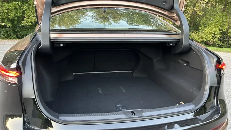
The Crown’s trunk (15.2 cubic feet) in comparison to the old Avalon (16 cubic feet) is a similar story, as while the Crown does offer a solid amount of space with a wide opening, the Avalon’s total capacity was larger and more useful. Additionally, the passthrough with both seats down in the Crown is a little cramped, so the edge case of trying to take home long, wide objects could cause issues for folks.
The Crown’s interior is certainly no Lexus masquerading as a Toyota, but it is nicer than what’s on offer in something like a Camry or RAV4. That said, we still think some additional color and trim options would class things up to make the Crown as regal as its name suggests.
Related video:

