What you need to know
- Google initially developed the Pixel Camera Bar to address the issues of bigger camera setups and to prevent the device from wobbling when laid flat.
- Further iterations of the bar in the Pixel 7 series were inspired by liquid metal surfaces and Material You.
- The Pixel Fold omitted the extension along the edges to align with the device’s unique look.
- The upcoming Pixel 8 will maintain the Pixel 7’s design from the Camera Bar.
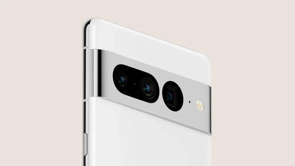
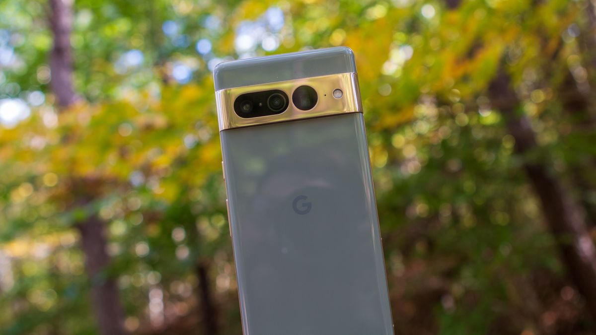
Since the camera bar made its debut on the Pixel 6 and Pixel 6 Pro in 2021, the feature quickly emerged as a staple of Pixel phones. Google calls the brainchild a “trademark” feature — which has since evolved over several iterations — and now the tech giant is spilling the beans on the feature’s evolution and design process.
In a company blog post, Google notes that “since its debut on Pixel 6, the camera bar has become a trademark of the lineup” and makes the device stand out in a sea of similar flagship Android phones known for their camera functions.
Regarding the camera bar’s origins, although the feature has a sleek design and unique look, the company wanted to address issues associated with bigger camera setups.
“If you look back at Pixel 5 all the sensors were all grouped into this little square — so when we knew the camera would be greatly improved, we wanted to do something different,” industrial designer Sangsoo Park said. “We didn’t want the phone to be bigger, and wanted to really maintain everything being contained and streamlined, but also celebrated in a way.”
With bigger cameras also comes the increased likelihood of phones wobbling if you use them lying flat on the table. And so, Google wanted to resolve the problem by arranging the cameras horizontally.
Google also discussed naming the visor “camera bar,” which — according to Pixel product manager Stephanie Scott — is “a nod to search bar,” the company’s inaugural feature.
The company further notes that the new design also brought some limitations with it, with several hidden constraints. For instance, Scott says, the main and ultrawide cameras needed to sit next to each other to enable portrait mode. “Some of our engineers likened arranging the phone to Tetris — finding a spot for everything,” she said. “I think it was more like chess, because the design is so interdependent.”
The subsequent introduction of the Pixel 7 brought further tweaks to the camera bar, as the company wanted to give it a more seamless look and give the camera even greater emphasis. This prompted the idea to integrate the bar with a metal frame. “We took inspiration from liquid metal surfaces to create this look,” said industrial designer Jaeun Park. Further inspiration came from Material You, Google’s design language, which incorporates circular and pill-shaped boxes that users can see on the Pixel 7.

The Pixel Fold, however, sported a more unique form — sparking a departure from the camera bar’s usual look. Instead of extending from the edges of the device, the visor is affixed on the back. The reason for this change, Google says, is to give the device more structure, with Park noting that it’s “just the right amount of the space between the hinge and the enclosure, so it’s visually nicely balanced.”
One thing to note is that the only devices Google mentions have already been released. However, you may have already seen images of the upcoming Pixel 8 series, which will be launched on October 4 and will pack many of the same designs we’ve seen in the Pixel 7.

