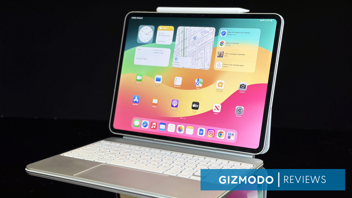
iPad Pro M4
The iPad Pro with M4 chip is beautiful and powerful, and now it just needs a base software that can support those capabilities.
The M4 iPad Pro seems built to be an alternative everything device that won’t slip into your pocket. Thanks to a new, bright OLED screen and chip, it’s as close as possible to that goal hardware-wise. It’s still lacking software that feels as versatile as what you can already find on an Apple-brand laptop.
The score is liable to change while we finish testing the iPad Pro’s brightness and battery.
Starting at $999 (Reviewed at $2,099, plus $129 Apple Pencil and $349 Magic Keyboard)
Pros
A beautiful OLED screen
Ultra-thin and light
Plenty of power for most tasks on iPad
Cons
iPadOS still doesn’t offer the “everything” experience
Cameras aren’t anything to write home about
The latest M4 iPad Pro is easily the most exciting thing Apple has released this year so far. Yes, it’s even more exciting than the Vision Pro. But why, you ask? What, just because it’s smaller and lighter than the Pro from two years ago? The big reason why is the new, pretty OLED screen. But more than that, it feels like we are coming so preciously very close to Apple’s true “everything device” that’s not just another dull phone refresh. This latest iPad Pro is so nice that it again reminds me how much better the experience would be if the software could match up to the hardware.
When Apple first announced its new iPad Pro and iPad Air, its initial, deservedly maligned ad implied the iPad could serve as a replacement for your laptop or, at the very least, become your go-to beyond the MacBook. The company has said in its press material the new iPad Pro has “desktop-class apps.” During the launch event, Apple talked about its new Magic Keyboard being “just like using a MacBook.”
Despite the number of creativity-minded apps available, the iPad Pro still isn’t direct competition for the versatility of a MacBook. Creatives could get more mileage out of the new capabilities of the M4 chip, which is indeed more powerful than the M2 was, but simply browsing the internet is less streamlined on tablets than on desktops and for no good reason. The iPad’s touchscreen environment feels less cohesive than that of the iPhone or Mac, which is a big problem when the 11-inch iPad Pro M4 starts at $999 or $1,299 at 13 inches. If you want more storage (1 and 2 TB models have a slightly better CPU) or cellular connectivity, you could be looking at a tablet that costs far beyond $2,000 before you even opt for the Magic Keyboard or Apple Pencil Pro.
Instagram and other Meta apps have long been utter crap on iPad. There’s still just one USB-C port that makes connecting accessories or docs harder than it needs to be. The humdrum 12 MP camera plus LiDAR scanner still doesn’t offer much utility outside of taking quick pictures of your dog or in select apps like SketchUp. Some of this is not necessarily Apple’s fault, but every time I get into the rhythm of using the iPad as my main device, I’m again reminded that it’s still just a tablet, with all the restrictions that entails. The iPad is not a great platform for those who want to multitask on multiple windows, even though I know that its 13-inch screen and improved processor could easily handle it.
The new, improved Magic Keyboard, strong performance with the M4, and ultra-bright, beautiful screen made for a great time, and yet it still leaves me wanting more.
I want to use the Apple Pencil Pro and all its unique features, but in a perfect world, I would have access to something at least as versatile as macOS. With all the accessories, this is the closest we’ll probably ever get to an Apple 2-in-1. It’s too bad the iPad Pro won’t be your laptop replacement.
My greatest hope is that during WWDC next month, Apple will unleash a new iPadOS 18 that can truly take advantage of the promise of the latest iPad Pro design. It could make it stand out compared to leading tablets like OnePlus, Google, or, more importantly, Samsung. Yet, I fear the company at the end of 1 Infinite Loop will stick too close to the trend of its PC competitors by overpromising AI.
iPad Pro M4 Display
It’s the Best Big Screen Apple Has Made So Far
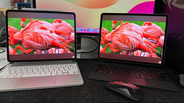
The new OLED display is sharper, brighter, and more colorful than the previous iPad Pro with the Liquid Retina XDR mini-LED screen. I watched the same content on both devices, and the Ultra Retina OLED display had far better depth and contrast than previous generations of iPad or MacBook screens. The previous pro screen looks less well-defined and more gray overall.
It’s what we already expect from OLED, but Apple’s displays are unique since it uses a so-called “tandem OLED” that uses two layers of panels to increase the overall brightness. Apple claimed the new Pro would get 1000 nits of SDR brightness and 1,600 nits of peak HDR brightness. Our 25% screen brightness indeed came up with just under 1,000 nits at SDR and a bit under 1,500 with HDR. At full screen, the brightness was just under 500 nits. Ignore all the big brightness claims, because the new iPad Pro does indeed feel brighter than previous versions of Apple’s tablet and it’s more than enough for using in both dimly-lit rooms or outside. Does it look better than other non-Apple OLEDs? Not so much, though on the whole, the uptick in brightness is a better overall experience than I’ve had on other OLED laptops like the Razer Blade 16 or the ROG Zephyrus G14.
The iPad does come with adaptive refresh rates that go down to 10 Hz and all the way up to 120 Hz, which is plenty for what you’re going to be using the iPad for. It can handle light gaming, but on most titles where refresh rates truly matter, you’ll never hit framerates that can take advantage of it.
Your grubby hands will inevitably mar the surface as a touchscreen and disrupt the viewing experience. That doesn’t change with the iPad Pro 2024. It does an alright job of avoiding glare from nearby lights, but not enough you can use the device under spotlights. The iPad Pro comes with the option for a nano-texture display glass, which is supposed to reduce even more glare, but we only had the brief chance to use it and see how well it can hold up to your regular microfiber cloth or our oily fingers.
Let’s also take a moment to finally breathe a sigh of relief at the fact that Apple moved its camera to the landscape side. It’s the best big screen Apple has ever produced, though it still has the wide bezels surrounding the display, the same size as past iPad models. If you really wanted to compare it to the MacBook Air 13, it’s a taller screen with slightly larger bezels but no dumb notch for the webcam.
iPad Pro M4 Performance
It beats M2 Handily, but it May Be Too Close to M3
The M4 chip launching with the iPad Pro for the first time seems premature, considering the M3 first debuted with Apple’s latest MacBook Pros at the tail end of 2023. Is that to say it’s not a powerful chip? Absolutely not, especially for the scale of the iPad. However, it feels more like a fork of the M3 than real new hardware.
According to Apple, the M4 is specially designed for the iPad, and Apple claims it includes a new display engine to handle the OLED display. It also contains a new neural engine that boasts 38 TOPS (that being trillions of operations per second). The neural engine, or NPU, is supposed to handle AI tasks. On paper, that’s slightly less than what’s been proposed by Qualcomm’s Snapdragon X Elite, a fellow ARM-based CPU. In practice, you really won’t notice the AI capabilities on the new tablet, at least not yet. Other M-series chips also had neural components, but Apple had no real need to talk about them until now. Geez, I wonder why it’s come up all of a sudden…
However, the CPU and GPU capabilities of the M4 definitely pushed the new iPad up in power. We compared the new iPad Pro with M4 side by side with an M2 iPad Pro with the latest version of iPadOS. We knew the M3 and M4 were more powerful than the M2 chip, but benchmarks do indeed show they’re indeed more powerful. On Geekbench 6, the M4 did 1,000 more points on CPU single-core settings and a little less than 4,500 on multi-core. It was far better on browser benchmarks as well.
Since the iPad Pro is going to be most helpful for creatives, Apple’s iPad needs to make a strong showing. In a rendering test on Octane X, the latest-gen iPad Pro took a minute and three seconds to render a scene of screws on a table. On the 6th-gen iPad Pro, it took 1 minute and 53 seconds. If the entire purpose of your iPad is handling these kinds of rendering tasks, then the new hardware is a help in that regard.
Graphically, the M4, with its 10-core GPU, should knock the base M2 around, and at least on paper, it does. In 3D Mark tests, the iPad Pro 2024 saw 23% better performance than the Pro model two years ago.
Now, we definitely don’t want to imply that the iPad’s latest chip is more or any less powerful than the laptops Apple also has on offer, but we couldn’t help but wonder how the iPad performs compared to the latest M3 chip. If I run Octane X on the latest MacBook Air 15 with the same amount of RAM as my review copy of the iPad Pro, it will run down the screw scene in about 57 seconds.
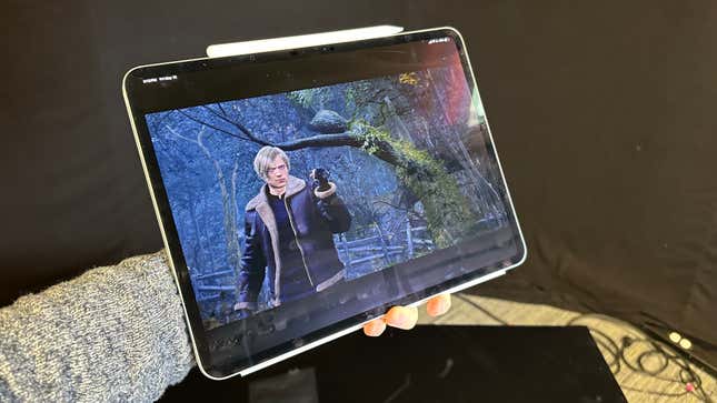
There aren’t many ways to compare Apples to Apples from a tablet ecosystem to a full-fledged Mac. For one, the iPad doesn’t have an easy, established way of tracking framerates in games. But for the sake of argument, I loaded up Resident Evil 4 on iPad Pro 2024, iPad Pro 2022, and the M3 MacBook Air. All ran with a relatively solid performance on the default low-to-mid settings. There are no graphics options on the iPad, but the two look identical across the older and new tablets.
On base M3 MacBooks, I get about 40 FPS in most environments in RE:4 and similar playability in Death Stranding. Still, at the very least, you have keyboard and mouse control options on the laptop version, whereas on iPad, I can hook up a Magic Mouse, but the games get confused about which controls you are using. Your best bet for gaming on an iPad is to hook up a third-party Bluetooth controller. If you only want to use touch controls, you’re far better off with more mobile-centric games, such as those offered for free with a Netflix account. The point is that even with the new Magic Keyboard feeling more like a MacBook than ever, it still has the inherent limitations of the iPad.
iPad Pro Design and Usability
The Slimmest iPad to Date Feels Great, but Apps Still Cause Issues
With all the accessories and attachments equipped, the iPad Pro 2024 is the closest it’s ever been to becoming an all-in-one device. By itself, it weighs 1.7 pounds less than the MacBook Air 13. Attached to the new Magic Keyboard, it weighs just about the same as Apple’s lightest laptop design.
The new Magic Keyboard with the function row starts to feel very much like a MacBook (not to mention, it was available on, even though the keys and their 1 mm of travel start to feel a little more hollow than the kind on Apple’s laptops. The aluminum palm rest and larger trackpad are both great additions. Other competing iPad-compatible keyboards and folios, such as the Logitech Combo Touch Keyboard, already had some of those features. Still, those who stick with Apple’s products won’t miss out on much save for perhaps a detachable keyboard.
Everything you already used your iPad for is here again in apps like Freeform or Notes. Watching Netflix or YouTube on the better screen is going to be a good time, though the aspect ratio of most movies on streaming doesn’t match the dimensions of the iPad, so even if it’s a 13-inch screen, you’ll still see the black bars on top or bottom of the screen. The same thing happens with some mobile games like Netflix’s and Supergiant’s Hades.
Passive entertainment is fine, but the iPad is still the iPad. Some apps have the same capabilities as their PC counterparts, but some don’t. Doing something as simple as right-clicking on a link to open a new tab in Chrome isn’t available. Neither is the right-click prompt for pasting and formatting on Google Docs. As we mentioned, Meta apps like Instagram still don’t play well on iPads. There’s a limit to what Apple can control, but it just points to the entire experience on iPad still feeling subpar.
But why would you spend so much money on the more expensive Apple tablet if you were going to browse the internet? You should be looking at the iPad if you’re into 3D modeling in some app like ZBrush. Apple granted Gizmodo access to a number of creativity-focused app betas, including the new Procreate and Procreate Dreams drawing and animation apps, Adobe Fresco, and the upcoming Logic Pro for iPad. We’re still using these apps and attempting to put them through their paces, though as somebody who doesn’t regularly draw or drop beats, I can’t sit here and pretend I honestly know if they include good features or not.
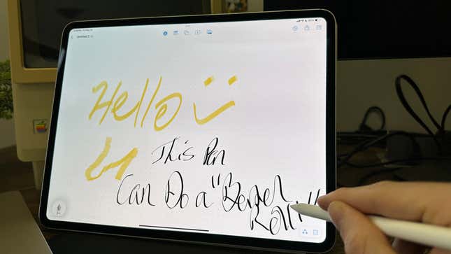
But I am indeed a writer, and with access to apps like Zinnia and Goodnotes, the iPad really comes into its own. I liked the new $129 Apple Pencil Pro with its squeeze function and barrel roll feature. It makes jotting down ideas as close to writing with a pen as possible without having some E Ink screen. I have much more to say about the Pencil Pro later this week, but if all I were doing was using the iPad Pro to take notes, I would be vastly underutilizing the new tablet, but I also wouldn’t regret that time spent either. If only I could say the same for some of my most-used apps, like Google Drive and Docs.
You can also connect the iPad to up to one external display, though, of course, you may be hampered a bit by the single USB-C port available. I hooked mine up to a full Studio Display, and both managed to run fine without any performance lag. Again, the issue comes down to usability. It’s not as simple as moving your windows from one screen to another. You load up apps to the big screen instead of the small one, and you’re limited to two apps in split view at once, despite the size difference from one screen to the next.
iPad Pro M4 Battery Life and Sensors
Fair Battery Life and Dull Cameras
The iPad Pro became my main device for the past half-week, and it still seems like Apple’s battery lifespan remains strong compared to other portable devices. Apple claimed you’d get a 10-hour battery life, but as always, you should expect just a little less than the promised performance.
Still, I used the 13-inch iPad Pro for a whole workday before seeing the battery dip into the red. That was with testing the iPad with games, with video, and with a fair few rendering apps alongside the usual browsing and typing. That was about seven hours before I needed to charge, which was with excessive use. We’re still giving it a bit to see how the battery performs under different workloads.
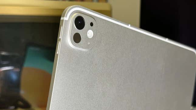
As for the camera, it really isn’t something to get excited about. Both the exterior and interior cameras are 12 MP, though the main wide camera can shoot up to 4K at 60 FPS. It won’t look professional quality compared to the iPhone 14 or 15 Pro. The rear sensor array also includes a LiDAR Scanner, flash, and Microphone.
Verdict
With all the trimmings, including the keyboard and Apple Pencil Pro, the iPad Pro with M4 feels like it desperately wants to become my main device for everything, save gaming. The 13-inch version I used was easily the best tablet Apple has produced so far. It’s far prettier than previous versions, as well it should be since it now costs $200 more starting than the one from two years ago. It comes the closest to being my favorite Apple device, far more than my iPhone, but inevitably, for everyday tasks, I’ll have to reach for a Mac or PC first before thinking of this tablet.
I relished my time using the Apple Pencil Pro so far, at least in the apps that let me. And there’s a fair point to being forced to focus on one app at a time. There are fewer distractions that way. But it’s still not all there. The iPad software environment on this new iPad Pro feels like Apple stuck a Tonka truck engine inside a Ferrari. This thing wants to go places, but software lets it down. We’re still giving it the full rundown, but unless there’s nothing else, either amazing or horrible, that comes up, I’m just going to wait and hope for something amazing to come down the pike in a month’s time.
If you’re creative, you already have a far better idea of whether the new Pro is worth your money. I advise everyone else to hold off until WWDC next to see whether the iPad can live up to its potential.

