Google and Apple enjoy taking each other on in as many different arenas as possible: mobile phones, maps, cloud storage, music streaming, photo management, note taking, smart assistants, tablets, smartwatches, calendars, web browsers, word processors, email, and more besides. In cars, we have Android Auto and Apple CarPlay vying for control of your dashboard.
We felt it was time to take a deep dive into the current state of play on these two platforms—which apps and which features are available on each, where the strengths and weaknesses are on both, and which is the better choice when you’re driving. It may be a small part of the Google vs Apple battle, but for regular drivers, it’s an important one.
Look and feel: Fairly similar
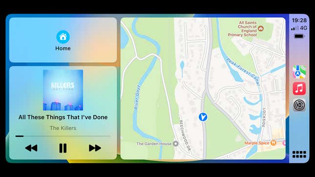
At the time of writing, Android Auto and Apple CarPlay both have a similar look when they’re on your dashboard—perhaps there are only so many ways to organize an interface like this. Typically, you’ll have your maps app in a large widget, your media app in a small widget, and quick navigation shortcuts in another small widget.
Both platforms let you put any app full screen if you need a better look at the route you’re taking or the music that you’re currently playing. You also get indications of your phone’s signal strength and battery level while you’re driving in both Auto and CarPlay, which is helpful to know while you’re on the go. Only CarPlay actually shows the time, but we’re assuming your car’s built-in instruments have that covered.
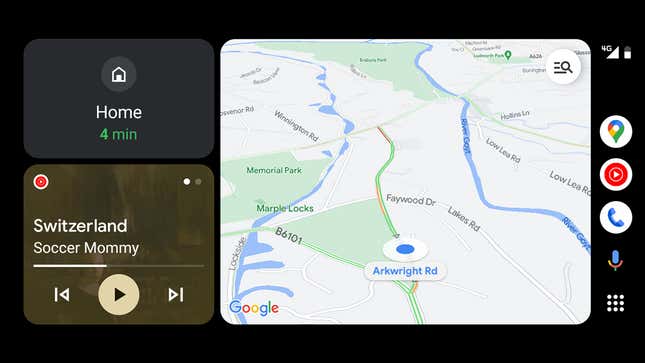
In both the Apple and Google interfaces, you’ll find a sidebar with quick links to your most recently used apps, and you can switch to a full drawer of apps with a single tap if you need to launch something else. Scrolling and navigating is all very straightforward, which of course it needs to be.
The usual aesthetic differences between Android and iOS are also evident in Android Auto and Apple CarPlay: The former is slightly more chunky and simple, and the latter is slightly more detailed and refined, when it comes to the text and the icons used. However, you won’t be confused at all if you need to switch between them regularly. They work in nearly identical ways.
Android Auto does give you a little more in terms of customizing the layout: You can put quick controls for apps down at the bottom of the screen if you want to, in a taskbar-style widget. In other words, playback controls for your media app can still be visible when your mapping app is taking up the rest of the screen.
That’s not possible on Apple CarPlay, other than on the default multi-widget layout. It’s a small difference, but it makes life slightly more convenient if you want your navigation system maps as big as possible while keeping your media playback controls accessible (that said, you may well have physical controls on the steering wheel in any case).
Apps and features
You’ve got a similar set of apps available on both Android Auto and Apple CarPlay—the usual suspects in the maps and media categories. Google Maps and Apple Maps are both available on Apple CarPlay, though you won’t find Apple Maps on Android Auto, which is unlikely to trouble you if you don’t have an iPhone. If you’re a Waze user, then you’re covered on both platforms.
Apple Music is available on Android Auto, as it is on Android. You’ll also find Spotify, Amazon Music, Tidal, Deezer, YouTube Music, and plenty more. You get a smattering of messaging apps as well, including WhatsApp, Facebook Messenger, and Google Chat. Neither platform supports video streaming apps, for obvious reasons.
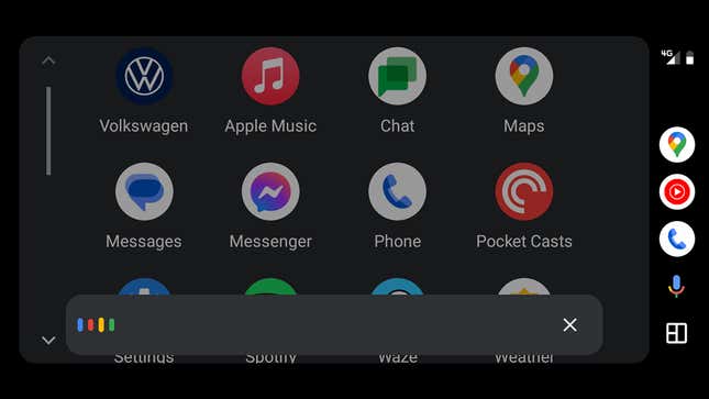
Over on Apple CarPlay, there are all the same audio apps that we’ve just mentioned. There’s less support for third-party messaging apps—WhatsApp is the best third-party option in terms of CarPlay support, but you can’t browse a list of messages and can only interact with the app via Siri. While Android Auto only shows messages in third-party apps that have arrived while you’ve been driving, it’s easier to review them, and more third-party apps are supported.
Both platforms give you the ability to pick and choose which compatible apps from your phone show up on your car dashboard. In other words, if there’s an app that you use on your phone but not in your car, you don’t have to have it showing up in the Android Auto or CarPlay dashboard—and app order can be customized in both cases as well.
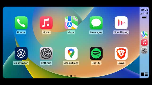
One plus for Apple CarPlay is the Now Playing icon in the app drawer, which is a handy shortcut to whichever media app is currently playing—it means you don’t have to dig through a list of apps to find the one that’s active. There’s no such screen on Android Auto, so you have to delve into individual apps each time.
Both Google Assistant and Siri are present on their respective platforms, ready to take action on your voice commands: Navigate to an address, stop the music playing, tell you the weather forecast, make a call, send a message. In terms of in-car use, they’re both pretty well matched and can take care of the same kind of tasks.
Settings and customization
Android is usually regarded as more customizable than iOS, and it’s fair to say Android Auto offers a few more settings than Apple CarPlay does. For example, you can set whether or not Android Auto starts up automatically with your car, and whether or not audio from your most recently used app starts playing right away—customization features you don’t get with Apple CarPlay.
Android Auto also lets you choose whether or not to show previews of incoming messages on screen, how maps should switch between day and night mode, and whether the navigation or media playback controls should be closest to the driver. These same settings can be accessed through your Android phone as well, if you find that more convenient.
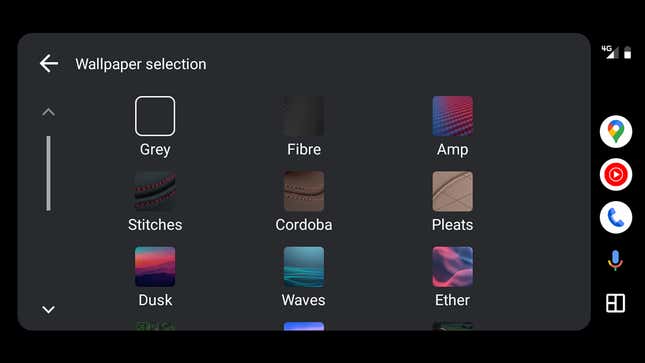
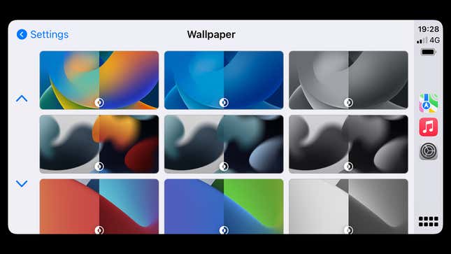
Over on the Apple side, you can choose between several wallpapers, you can force dark mode or have it set automatically based on the time of day, and opt to have the Driving Focus mode enabled whenever CarPlay is activated—that gives you plenty of control over which apps and which people can distract you while you’re on the move.
iOS also lets you choose which apps trigger notifications on the CarPlay dashboard and which don’t—on Android Auto, you don’t get that level of control, and the same notification settings will be used on your phone as on your car dashboard. It is possible to have Do Not Disturb on Android enabled whenever Android Auto starts up, but it’s not quite as easy to configure as it is with CarPlay and an iPhone.
Android Auto and Apple CarPlay are currently very evenly matched when it comes to how they look and the features they offer. There are small differences, but nothing that means one platform is significantly ahead of the other in terms of what you’re able to do in the car.
It’s worth mentioning that Apple has a significant upgrade for CarPlay in the works for late 2023. The company announced it plans to integrate CarPlay further with the instruments fitted to your vehicle, as well as offering more widgets, support for multiple displays, and a built-in FM radio app. We’ll have to wait and see when these features roll out, and how broadly they’re going to be supported.

