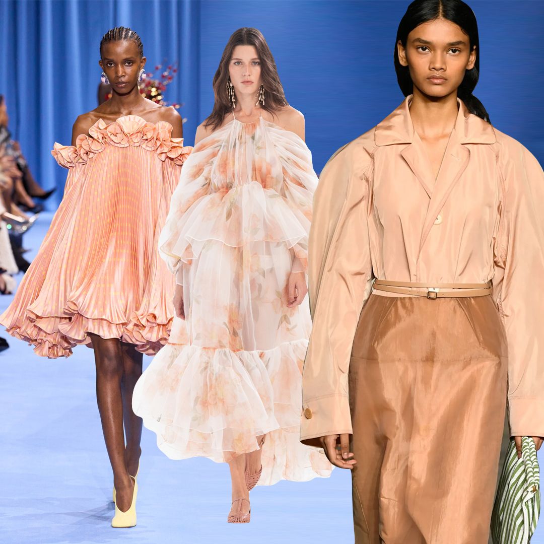
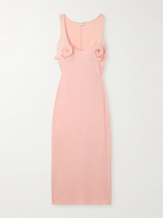
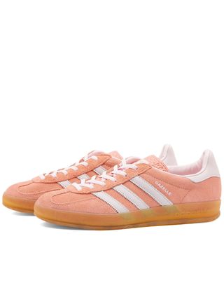
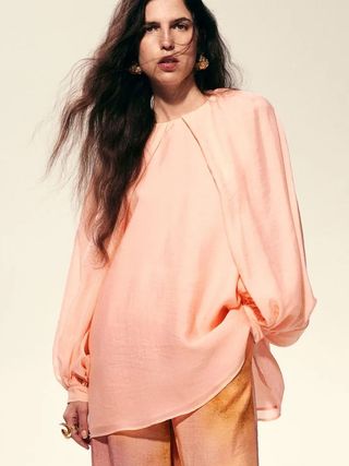
It’s safe to say that Angela Baidoo has earned the title of fashion expert. As a trend consultant and senior strategist who has worked with brands as diverse as WGSN, UAL, The Impression, and Burberry, Baidoo certainly knows her stuff when it comes to analysing and discussing what will be big this year and which trends have fallen just a tad short. Nearly six months into 2024, we asked for her thoughts on Pantone’s Colour of the Year 2024: “Peach Fuzz”. Here, she takes a deep dive into the colour trend and ponders why peach, whether it has fulfilled its destiny as the Colour of the Year, and if not, why? Plus, she investigates the colours that have come to the fore instead and that fashion people are really wearing.
What Is the Colour of the Year 2024?
Every year at around the beginning of December, it has become a tradition for Pantone (which creates international colour standards used across fashion, beauty, interiors and architecture) to give one colour the coveted title of Colour of the Year.
In 2009, Mimosa was a warm yellow which signalled hope a year after the credit crunch, whilst in 2021 a timeless shade called Ultimate Grey reflected the need for reassurance after the uncertainty of 2020—a colour whose effects are still being felt today as the revival of tailoring aligns with a slow return for most of us to the office.
For 2024, it was announced that the Colour of the Year would be Peach Fuzz, or Pantone 13-1023, to give it its official name. There were many reasons for the choice, but one of the main drivers was that it would provide a soft landing for the chaos which still surrounds us in today’s climate. Hoping to instill a warm and fuzzy feeling, Peach Fuzz converges at a point where the digital world meets reality, especially as creators increasingly use AI to develop dreamy images of otherworldly places we would all love to escape to.
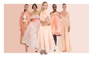
(Image credit: Launchmetrics Spotlight, Chanel, Zimmermann, Alaia, Tom Ford, Getty)
“Caring”, “Community” and “Cosiness” are words Pantone has associated with its 2024 colour choice, and they just so happen to be the emotional triggers which “Effortlessly bridge the youthful with the timeless,” according to Pantone’s Executive Director Leatrice Eiseman. So, even though it may have been considered a divisive choice at first, it may actually bridge the generation gap as a colour everyone from Boomers to Gen Z can get on board with.
Why Peach Fuzz?
As much as many different industries wait on Pantone’s yearly predictions, signs of the pastel peach hue were already emerging on the runways before it was announced as the colour of 2024. As early as last September’s S/S 24 shows (four months before the announcement), we saw Zimmermann’s high-waisted skirt, Tom Ford’s satin safari jacket and Alaïa’s transparent PVC dress and trench coat co-ord pre-empt Peach Fuzz’s confirmation as Colour of the Year. Consider too that Lila Moss wore a confection of fluffy Fendi feathers for her Met Gala look in 2023—the ultimate endorsement for the incoming peach moment if ever there was one.
Whilst not the easiest shade to wear, it can also have a much edgier feel. Think less #grandmacore and more kink, as designers such as Pieter Muller at Alaïa and Simone Rocha as guest designer for Jean Paul Gaultier Couture used transparent rubber and horned corsetry to reimagine powerfully feminine silhouettes in the colour. It should also find its sweet (no pun intended) spot across the beauty market, as the warm undertones will work well as a new option for blushes and bronzers across a variety of skin tones.
So, Six Months in, Are We All Keen on Peach?
In many ways, we can say yes, as we actually saw pastel peach tones coming through in 2023, and when it was announced as the official colour for 2024, it made complete sense, as brands and designers were already testing it out in the market. Add to this the continued dominance of all things “girly”—think the coquette aesthetic, Somerset House’s major exhibition, Cute, the TikTok trend encouraging users to romanticise their life and bows everywhere—and Peach Fuzz is a colour that has met the moment.
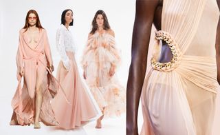
(Image credit: Launchmetrics Spotlight, Zimmermann, Rochas, Alberta Ferretti, SMC)
But there is also the argument that despite being named Colour of the Year, it often takes a few years for a colour to truly become part of the culture. This may explain why WGSN has already predicted 2026’s Colour of the Year as Transformative Teal. And, fun fact: in 2022, the trend forecasting agency had earmarked Apricot Crush (sound familiar?) as its 2024 Colour of the Year, which explains why the shade had already started appearing across products as diverse as consumer tech and luxury handbags.
Diving deeper into the art of colour forecasting, a similar colour called Cantaloupe was called out as Colour of the Year for 2020 (by WGSN), which at the time was used to promote the idea of optimism and joy which was desperately needed. So, it would seem that Peach Fuzz is simply an extension of Cantaloupe, and instead of seeing it everywhere this year, expect a slow burn of adoption as consumers, designers and brands continue to get used to the shade.
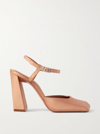
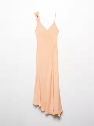
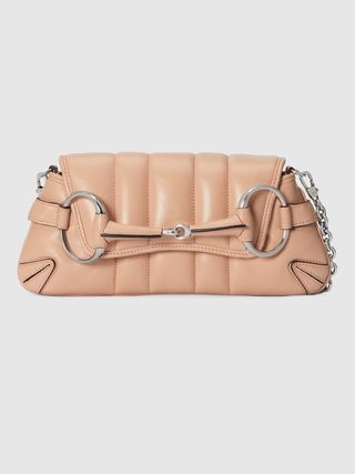
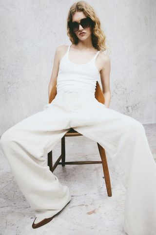
Shop Peach:
Many Passed on Peach and Picked These Shades Instead…
Choosing not to place all their bets on Peach Fuzz or refusing to be dictated to by a Colour of the Year, designers also decided to colour their collections with other key shades, which you may have actually noticed permeating fashion more than peach.
1. Top-to-Toe Neutrals
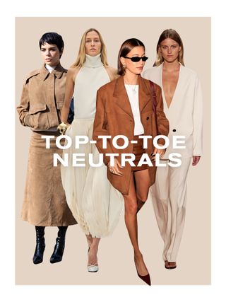
(Image credit: Launchmetrics Spotlight; Alaia; Ffrome; Getty)
Referred to as “Latte dressing”, this is simply a blend of warm tans, chocolate browns and frothy creams worn in cosy layers or rich textures. Think cashmere sweaters and satin slip dresses or tonal workout gear. Now of course, there is the danger that these tones could be considered varying degrees of “boring” beige, but it’s the way they’re styled—using hues from the palest of pales to the deepest of darks—which gives them a new spin. The return of boho (spearheaded by Chemena Kamali’s recent debut for Chloé) will also mean we are set to see more neutral tones than ever, floating down the street in layers of chiffon or dressing up festival looks via fringed suede waistcoats or short-shorts.
Shop Neutrals:
2. Red
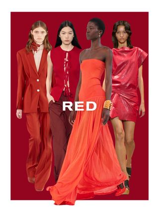
(Image credit: Launchmetrics Spotlight; Del Core; Zimmermann; Isabel Marant; JW Anderson)
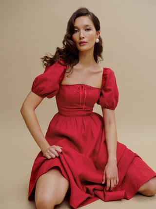
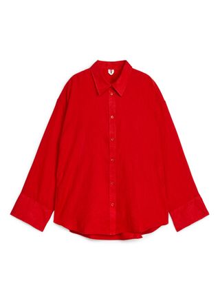
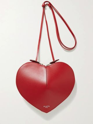
Many will put it down to the “Gucci effect”, but love it or loathe it, the Italian fashion house has everyone seeing red. After new creative director Sabato De Sarno introduced a distinctive shade of oxblood called Gucci Rosso Ancora in 2023 as part of his brand revamp, it has become a go-to colour for the summer season. Red has been seen in many guises and has adorned every kind of product from Alaïa’s Le Coeur heart-shaped bag to Kylie Jenner and her daughter Stormi opting to “twin” in matching red outfits at the Jacquemus show in January.
Whether used to signal power, passion or danger, red will draw attention to even the most die-hard extroverts who want to experiment with the shade. The impact of red cannot be underestimated; you only have to look to MAC’s Ruby Woo lipstick which has become part of beauty lore and is still the brand’s best-selling shade.
Shop Red:
3. Butter Yellow
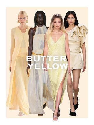
(Image credit: Launchmetrics Spotlight; Zimmermann; Bally; Del Core; Versace)
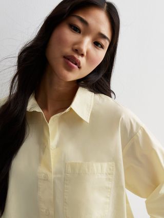
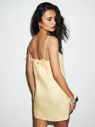
The contrast of simultaneously soothing and striking colours will be a key influence for the upcoming season, matching the need for stillness and fearlessness all at once in these uncertain times. Butter yellow is the slow slide into warm-weather dressing that you never knew you needed, working perfectly in Jil Sander-esque minimal outerwear (rain macs offer all-season practicality) or Bottega Veneta-style cotton shirt dresses (floral embroidery or a puffball hem will add a pretty flair). Considered a happy colour for its sunshine associations, adding this shade to your everyday wardrobe will act as an instant mood booster.
Shop Butter Yellow:
4. Grey
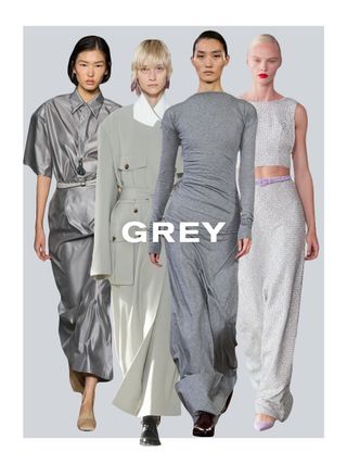
(Image credit: Launchmetrics Spotlight; Carven; Dries Van Noten; Carolina Herrera; Victoria Beckham)
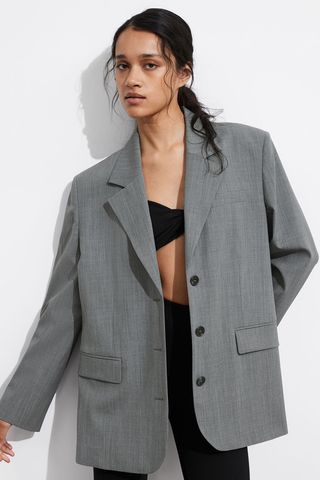
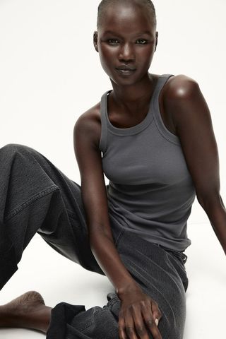
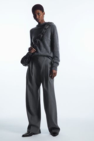
Grey has finally made it out of the boardroom and become a favourite of the fashion crowd for its reinvention as the subtle shade which goes with everything. Minus the seriousness of the Power Dressing years, grey has become a more inviting, warmer colour used by content creators to smarten up their high-low looks, including chunky knits and tailored trousers or fitted waistcoats with satin maxi skirts. Coming at a time when “quiet luxury” was proving its popularity, brands such as The Row, Victoria Beckham and Max Mara championed the hue.
But what has generated the most buzz is the fact that grey is now being increasingly used for the summer season. Seen across sheer knits, strapless, sequined dresses and draped jersey minis; its subversion has garnered new fans. That and the staying power of comfort-driven sportswear and utility hybrids, from the grey marl hoodie to silver-grey New Balance 530 sneakers.
Shop Grey:
5. Sky Blue
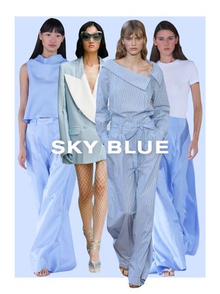
(Image credit: Launchmetrics Spotlight; Staud; Alberta Ferretti; Nina Richi)
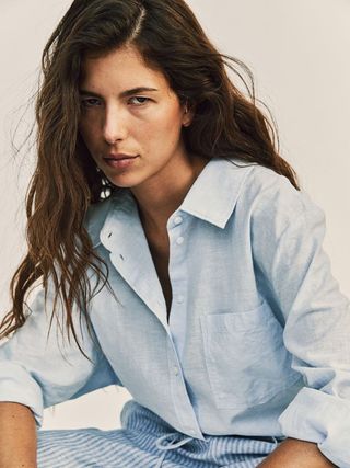
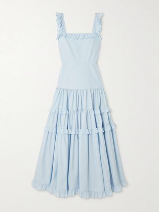
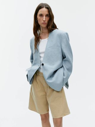
Pastels will always remain a no-brainer for summer as we seek to regress into the softness of all things light and airy. This palette also allows for easy outfit-building at the start of the day, effortlessly complementing other colour families like darks, brights and neutrals. In 2024, sky blue in particular is being used as a go-to for modern uniforms, from crisp Oxford shirts to oversized blazers, and as if right on time, this shade is also spilling into denim-on-denim looks, aligning with the rise of “cowboy chic” following the release of Beyoncé’s Cowboy Carter country album.
Shop Sky Blue:
Do We Really Need a Colour of the Year?
As much fun as it is to play Colour of the Year roulette every year, many consumers and industry experts are starting to question the responsibility of pushing a single colour option which will be in for 12 months and out the next, as it only adds to the ongoing pressure of “needing” to keep up with the crowd by having the latest version (read: colour) of a phone case, bag or dress style, for example.
An embrace of slow fashion and conscious consumerism (an alternative to “consumption”, which focuses on a lifestyle shift towards consuming less and buying better) means that consumers are turning towards building their personal style via shopping their existing wardrobes and reframing the idea of everyday luxury: a great-quality white T-shirt from Uniqlo, for example. Counterbalance that with a far more sped-up trend cycle (looking at you, TikTok), and the idea of a single colour dominating the whole year holds less weight.
What it does offer though, is a light-hearted way to make sense of the world, in the same way that “Mercury being in retrograde” explains away those late-night calls to the ex or travel chaos. A soft, fuzzy colour which we can all escape into at a time of unease and unrest makes sense, but it should be one you keep as part of your wardrobe for more than the assigned 12 months.

