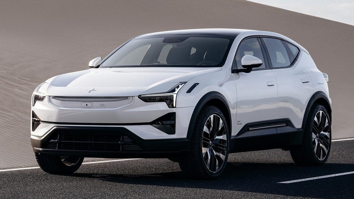
With a base price of just under $84,000, the Polestar 3 won’t be cheap. But if you can afford it, it looks like it’s going to be a stylish, desirable electric crossover with plenty of power. Recently, Australia’s WhichCar got a chance to sit down with the designer, Nahum Escobedo, to talk about the 3.
When asked about his design pet peeves, Escobedo seemingly took a shot at Mercedes-Benz and its EQ lineup, saying, “One of them is the roundness of cars that are becoming almost potato-shaped, or like a Jelly Bean, because that’s perfect for aerodynamics. Obviously, we want to do something different.”
That wasn’t the only strong opinion he shared, though. Escobedo also really doesn’t like the trend of adding more lights to both the interior and exterior of vehicles. Again, it sounds like he was taking a shot at Mercedes and the CLA concept’s illuminated grille.
“At least in our brand, when you see our cars you will see the dual blades, you’ll see the brake lights, and you will not be disturbed by all these lights going around the car,” he told WhichCar. “Because at the end of the day we want these vehicles to be for the driver to experience and enjoy the drive. If you really want that sort of entertainment, you know, you go to Vegas, or you go to a nightclub maybe? I don’t know. But not in our cars!”
Escobedo also said he thinks it’s important to make sure you can actually tell which automaker designed a vehicle without having to look at the badge. For Polestar, that means using Scandinavian design cues to stand out in a sea of increasingly homogenous crossovers.
“We take a lot of pride and spend hours and hours trying to make sure that our cars look a certain way so that when you look at them you say ‘that’s a Polestar’ because of the way it’s designed, not because it has an emblem the size of a wheel,” he said. “That’s part of the Scandinavian design philosophy. If you go to a furniture store, you will be able to detect which chair comes from Scandinavia — the same thing with our cars. The emblem is integrated, it has a function — it is our brand — but when you look at the design you know it’s a Polestar, not because of the humongous label.”
While we have yet to see the Polestar 3 in person, we’d certainly say Escobedo and his team succeeded. It really is an attractive car that takes a lot of what Tesla gets right about minimalist design and goes even further with an actually distinctive design. Plus, you know, there’s no huge illuminated grille, which is always a plus. Sorry, Mercedes.

