As soon as I saw the cover slide for BusRight, I knew I was looking at something really interesting. BusRight is a school-bus management platform that aims to improve efficiency and safety by, among other things, allowing caregivers to track bus locations. It also offers route-mapping and real-time GPS.
Running a school bus network is complex, and in a world where tech savviness is variable, creating tools is crucial. I’m not a parent myself, but I’m going to hazard a bold assumption that, in general, losing kids on the way home from school is pretty unpopular.
Somewhere in that latticework of challenges, there’s an opportunity, which BusRight jumped on. It was then able to grow the product into a business worthy of a $7 million cash injection.
We’re looking for more unique pitch decks to tear down, so if you want to submit your own, here’s how you can do that.
Slides in this deck
- Cover slide
- Go to market slide
- Target audience slide
- Market size slide
- Problem slide
- Solution/product slide
- Traction slide
- Sales process slide
- Business model/unit economics slide
- Testimonials slide
- Sales decision dynamic slide
- Growth projection slide
- Team slide
- Closing/contact slide
Three things to love
BusRight’s pitch deck is well-designed and full of careful touches. Here are some highlights:
Great customer slide
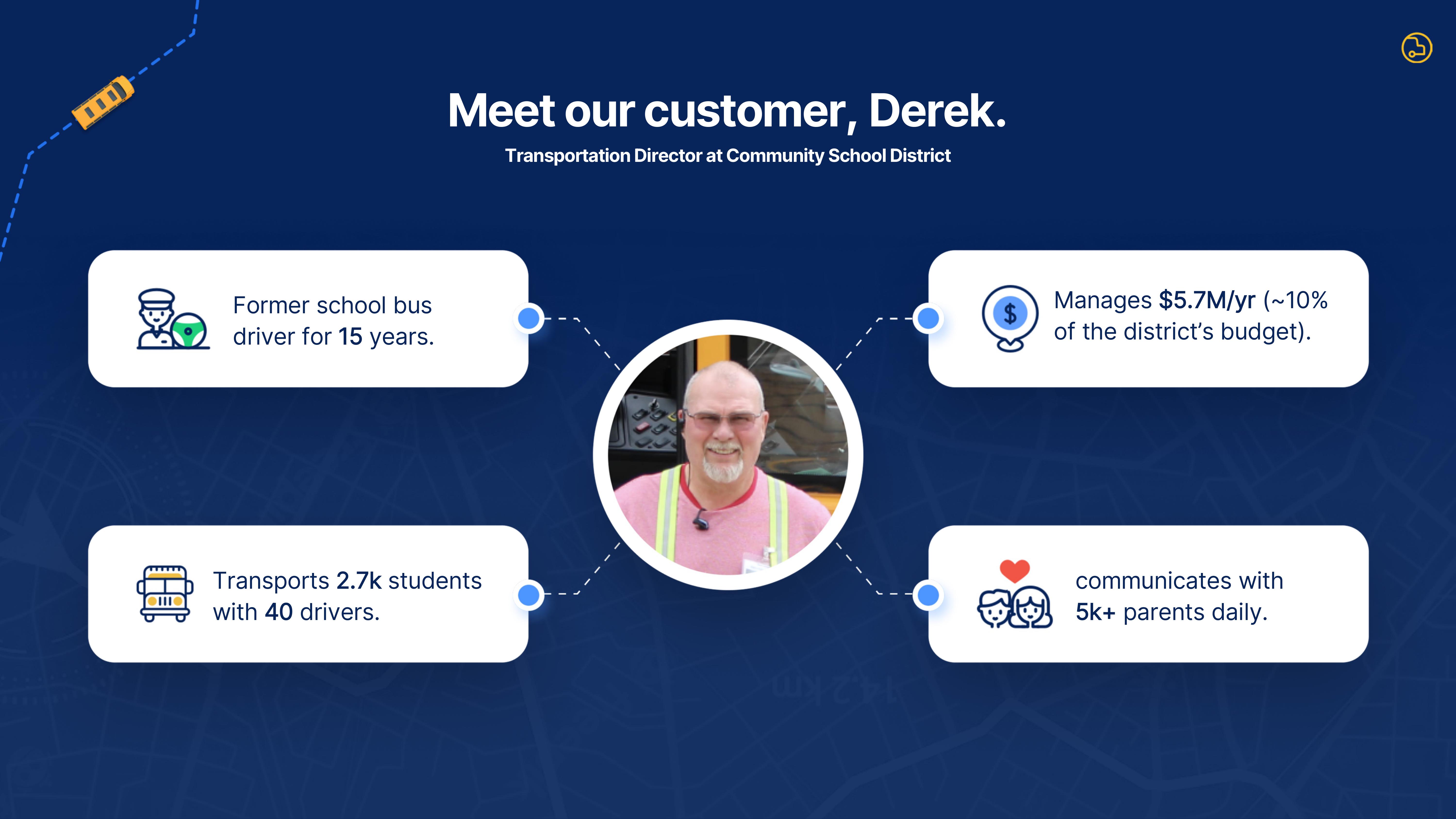
It’s tempting to dive into the unit economics, the growth trajectories and all the ways that the problem is awful and the solution is genius and the product delights. But in the middle of all that, the customer sometimes gets forgotten. For some companies, the customers aren’t a focus and can safely be glossed over. In this case, however, reminding investors whose lives they are helping is a really nice and elegant touch:

[Slide 3] Hello, Derek. Image Credits: BusRight
The slide does a great job humanizing who is affected by the problem being solved. I don’t know much about schools, but I can imagine that being the transportation director for a school district is an arduous job. If everything works perfectly, the buses would pick the children up and drop them off on time every time. But perfection doesn’t exist: Buses break down, people are late and incidents happen.
Putting upfront why this is a problem worth solving — and who it’s affecting — is a great strategy. The lesson here is to think about the human angle of the story you want to tell.
From the fluffy to the hard-hitting
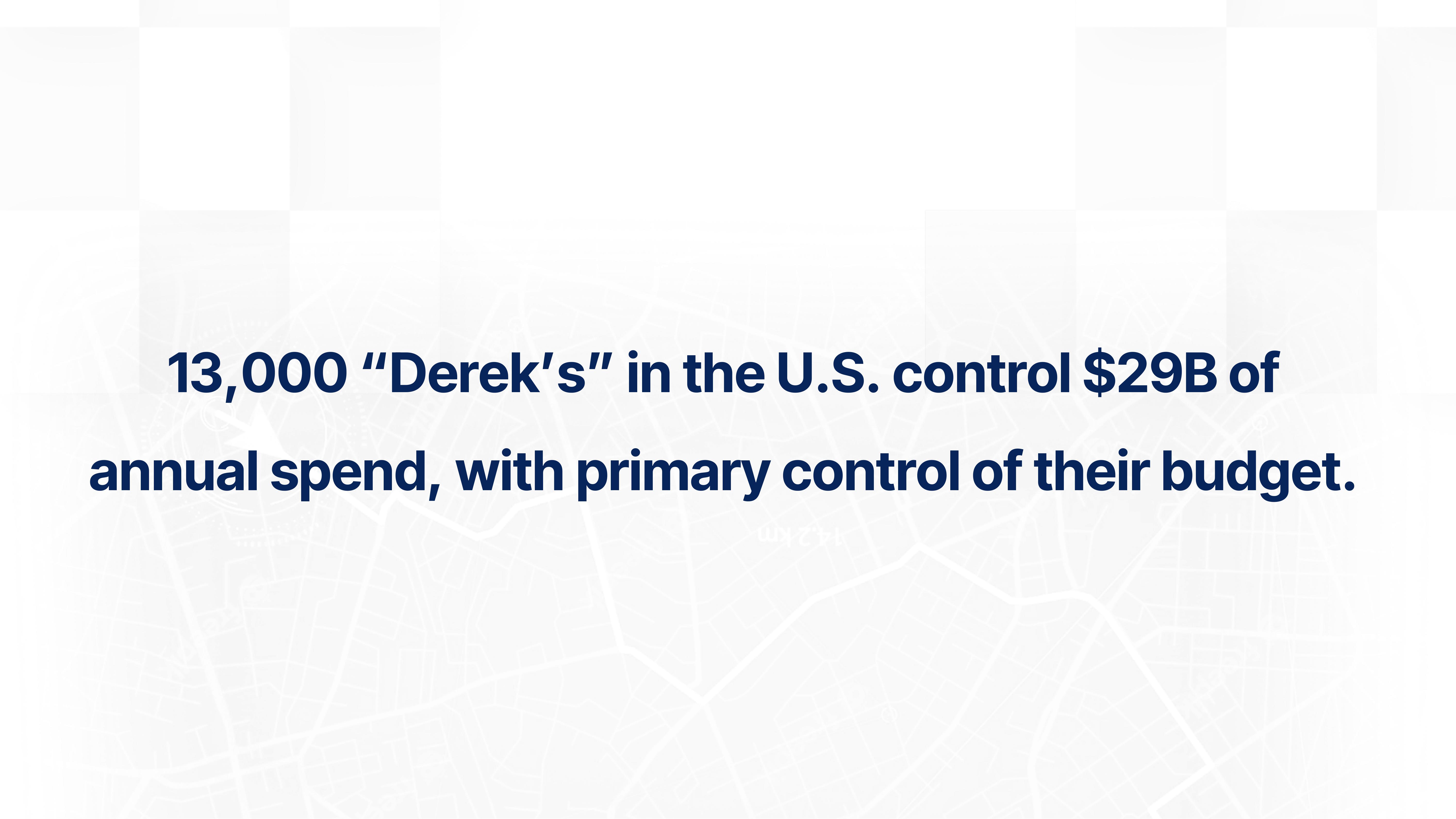
If you thought the Derek slide was heartwarming, you’re not alone. But if you’re an investor, your next logical question is likely: “How many Dereks are there?” Almost presciently, BusRight answers that exact question on the very next slide:

[Slide 4] Maximum Derek! Image Credits: BusRight
BusRight could very easily have made this point on Slide 3, but answering the question before anyone has time to ask it?
Insert chef’s kiss here.
Wait, I’m in charge of this article. I can insert a literal chef’s kiss. I love my job.

Carlton Carlson’s chef’s kiss from the Simpsons. Image Credits: “The Simpsons”
Win/win/win — and maybe win?
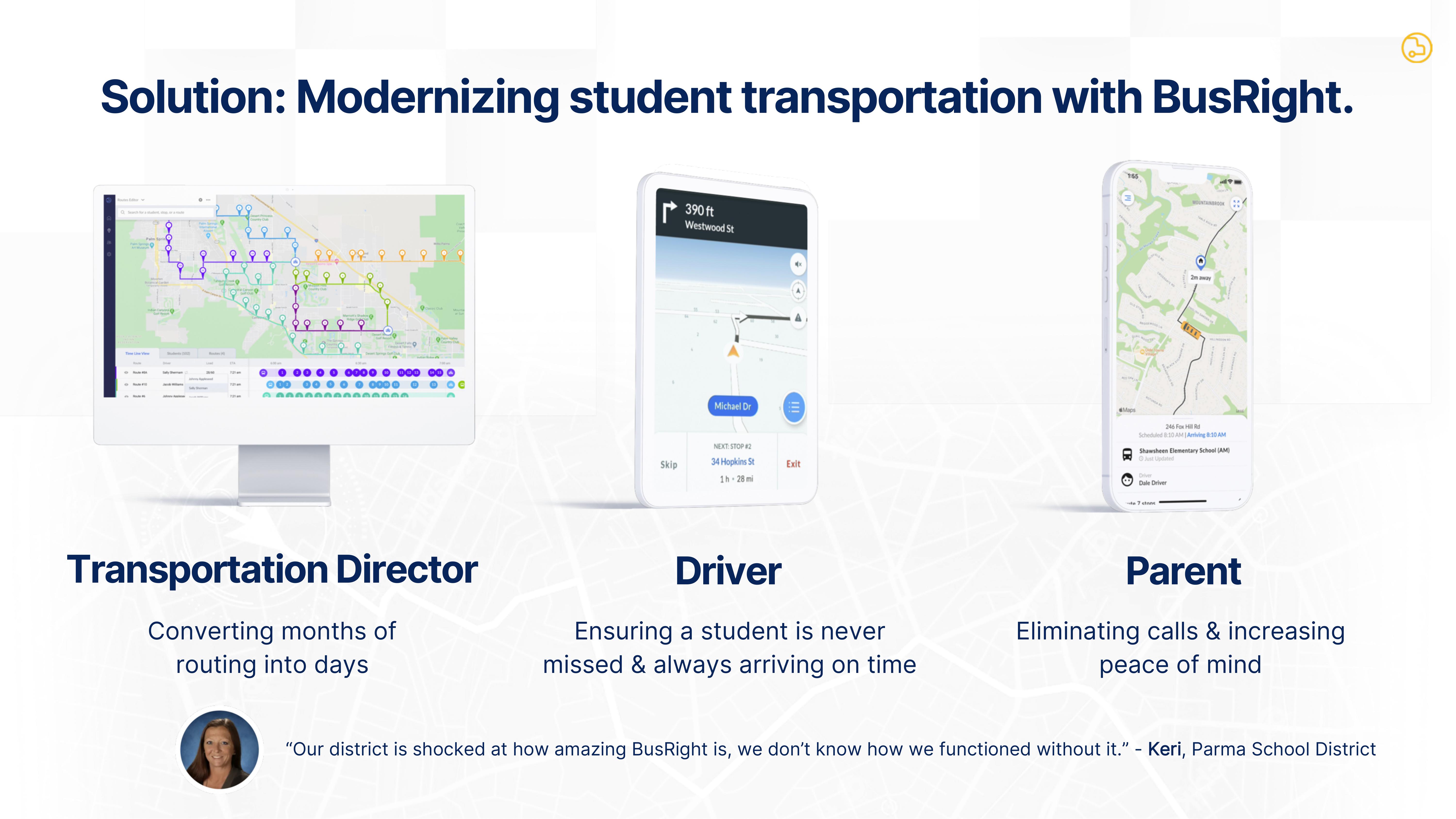
Illustrating how the BusRight product is a win all around for kids, parents, bus drivers and the machinery that powers everything helps plant a seed that this might be a win for investors, too. Very well done:

[Slide 6] Bussin’ a move. Image Credits: BusRight
Showing the value propositions for each of your stakeholders is a smooth way to nail home the point. Including the “we don’t know how we functioned without it” quote underneath is just the cherry on top of the icing on top of the whipped cream on the cupcake. It’s so well done I want to, well, invest.
In the rest of this teardown, we’ll take a look at three things BusRight could have improved or done differently. The first few slides are great, but the company made some pretty big goofs along the way, too, so there’s plenty to learn from. I’m also including the full pitch deck, so you can get the full example!
Three things that could be improved
A lot of the time, the problem with a pitch deck isn’t what is there; it’s what is missing. There’s a checklist I use when evaluating decks for my pitch coaching clients, and BusRight left out some pretty significant information, and I imagine investors weren’t happy about that.

