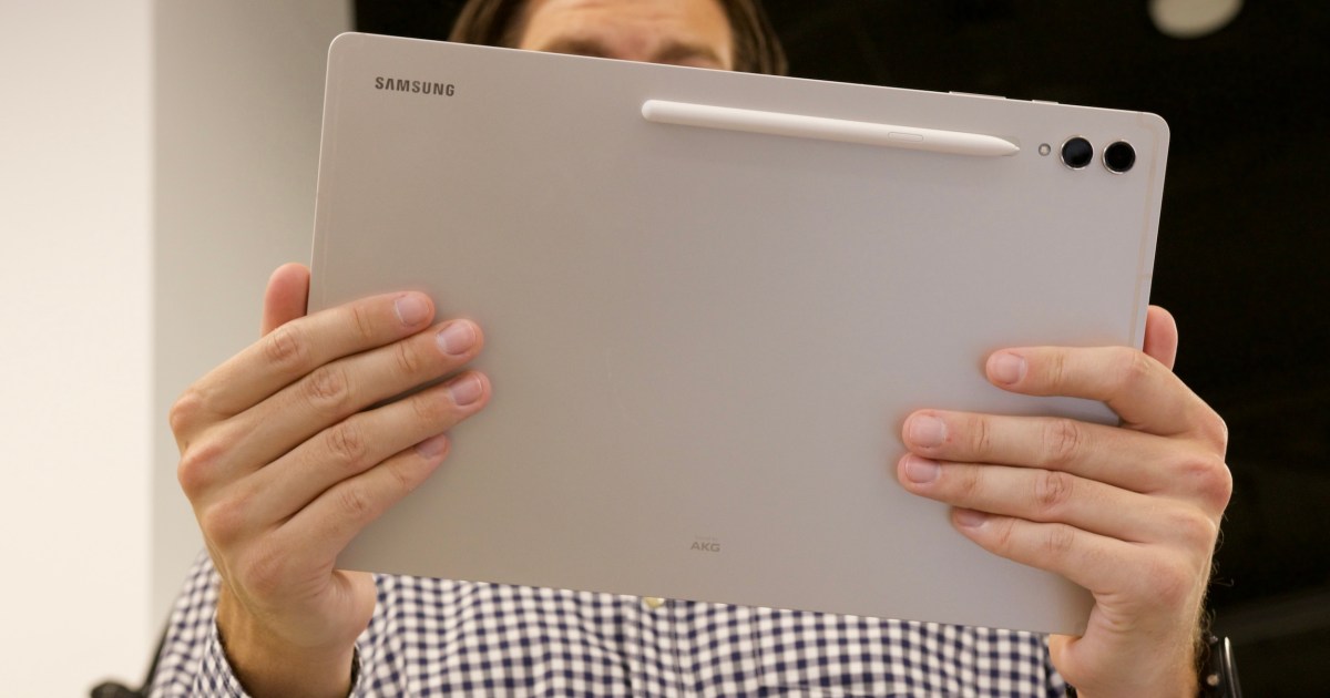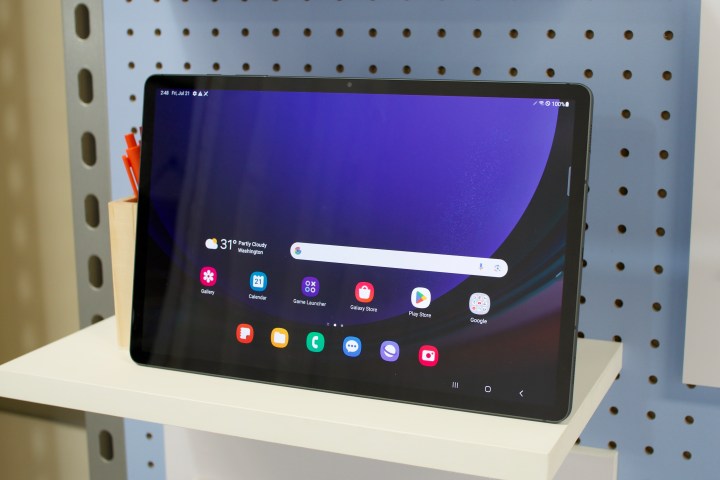
“Android tablets are a lost cause.” I come across this recurring theme more often than I would like, but there’s some truth to it. As someone who pushes Android tablets as a daily workhorse, I’ve defended on numerous occasions how the ecosystem has matured over the past few years after Android 12L and foldable arrived on the scene.
But compared to the iPad, Android tablets keep falling short. With every brand trying to create its own unique software flavor for tablets that vary dramatically in terms of firepower, no two Android tablets seem to offer a uniform experience. iPads, on the other hand, do deliver experience uniformity irrespective of the screen size.
But in the Android world, Samsung offers the most mature experience, especially on its flagship tablets. And if you really push these machines, they even serve a better value than some iPads. Following the July Unpacked 2023 event, Samsung is back in the flagship tablet game with the Galaxy Tab S9 trio. They look promising, but I’m also worried about a cycle of serving finesse without depth.
The Galaxy Tab S9 series makes a leap
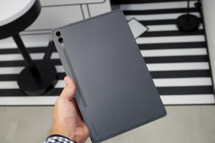
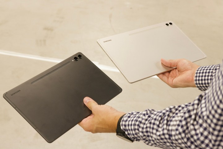
On the surface, the Galaxy Tab S9 series looks like a modest upgrade, but even at that, the changes run deeper than a typical generation-over-generation upgrade for an iPad. Even the cheapest model now features an AMOLED display with a dynamic 120Hz refresh rate. For comparison, the 11-inch iPad Pro still has an LCD screen for $799.
There’s a neat Vision Booster system that bumps up the color contrast based on the ambient light situation to offer the best viewing experience. Samsung has the fastest Qualcomm processor in the chipmaker’s inventory and has added an IP68 rating to both the tablet as well as the included stylus. That’s another huge win over Apple.
Going a step ahead, Samsung reworked the internal hardware and employed a bi-directional heat dissipation system to keep the Galaxy Tab S9 cool. For the first time, Samsung even put a vapor chamber cooling system that one usually finds in either gaming phones or top-tier Android flagships like the Samsung Galaxy S23 Ultra.
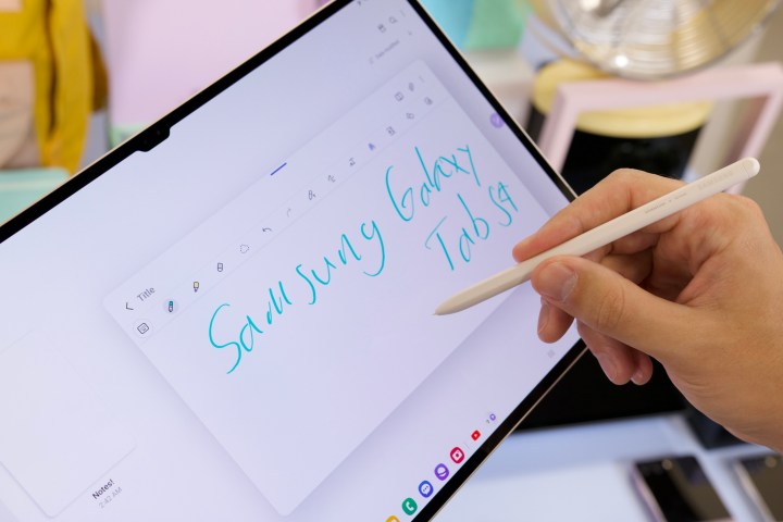
The battery size has also gone up, which is always a welcome change. Overall, it looks like Samsung spared no expense under the hood while designing the Galaxy Tab S9 series. In fact, if one were to do a side-by-side hardware comparison, the Galaxy Tab S9 just might look like the better deal for $799 compared to Apple’s current iPad Pro. But I’m pretty skeptical about the whole situation here.
Once again, an underwhelming software showcase
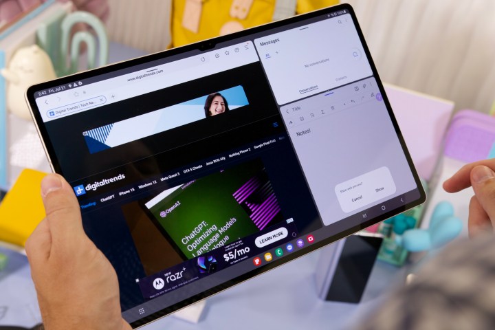
Curiously, Samsung focused on how it is bringing some productivity apps like LumaFusion for video editing, Goodnotes (which looks awfully similar to Apple’s Freeform app), and ArcSite to the Galaxy Tab S9 series. It’s a great initiative. After all, why have all that firepower if there aren’t any apps to use in the first place?
But what really surprised me was that Samsung didn’t dig into the One UI experience for its new tablets. And that’s because there aren’t any iterative upgrades on the software side — at least not right now. I’ve repeatedly labeled One UI as the most functionally rewarding and versatile skin for Android tablets, especially if you want a desktop-like experience to get work done.
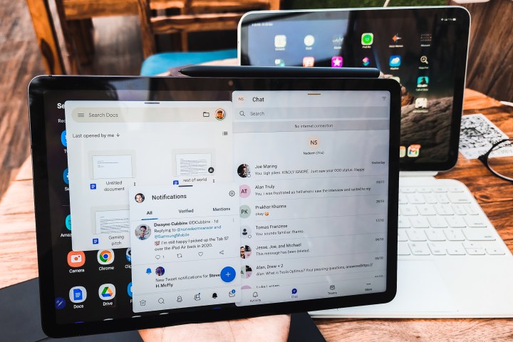
And yet, Samsung appeared worryingly distant from discussing its One UI 5.1 software. That’s because there don’t seem to be any new noteworthy additions. Even Samsung’s experience guide handed out to media personnel propped up features that are already available on the Galaxy Tab S8 series, such as multi-window and pop-up view for running multiple apps, DeX mode, multi-control, quick share, and secondary screen support.
These are all amazing features and get you as close to the cross-device connectivity in the Apple ecosystem as it gets. In fact, Samsung’s window management was superior to Apple’s Stage Manager — even in its most advanced form in iPadOS 17. But it would have been great to see at least a few new One UI 5.1 tricks.
Samsung can’t doze off on progress
For better or worse, Samsung is the torchbearer for Android tablets. And it has been loyal to the cause longer than any other brand. Even Google — the Lord of Android — has had a frustratingly on-off commitment to Android tablets. Even with the Google Pixel Tablet, the focus remains on smart home assistance and entertainment rather than hardcore large-screen productivity.
For another year, the onus is on Samsung to redeem Android tablets as a standalone category of large-screen productivity machines, and the Galaxy Tab S9 is the test bed. A healthy bunch of my colleagues balks at the idea of One UI being a part of their daily smartphone routine, and for valid reasons. I, for one, have remained a One UI enthusiast for the tablet experience.
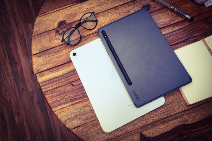
But it seems like Samsung is squandering a lead here. iPadOS started off as a stretched-out iOS interface tailored for Apple tablets. With the release of iPadOS 17 (currently in public beta), it looks more mature than ever. Stage Manager is finally usable , and even with the new-found window management flexibility, app scaling is not an issue at all.
One UI 5.1, despite offering more versatility in window management in its latest build, still suffers from badly scaled app interfaces. Apple wins because it dictates the rules of user experience for both in-house as well as third-party apps. Samsung doesn’t. That part is Google’s responsibility, but I’ve waited years — in vain — for it to get sorted.
Hope ahead, but history speaks for itself
Samsung knows that all too well, and it has tried to mask those flaws using its own tricks in One UI. That’s also the reason why I was mighty excited for this year’s final Unpacked event to see what Samsung has done with One UI for its tablets. I love the meaningful hardware upgrades and can’t wait to try the new pro-grade apps like LumaFusion.
But a tablet is only as good as the software experience it delivers. If it can’t wow anymore with meaningful upgrades, there is little reason to drop close to a thousand dollars on it, especially when the iPad Pro can deliver a meaningfully deeper selection of apps and a more streamlined experience.
Maybe Samsung is waiting for Android 14 to arrive in the coming weeks to detail the enhancements it has made to One UI for tablets. But at least announcing them at Unpacked wouldn’t have hurt. Ignoring it sends a message that Samsung has either not done enough work on the software side, or it is not confident in flaunting One UI as a worthy competitor to the iPad experience. Either way, it’s disappointing to see.
Editors’ Recommendations

