Kaitlyn Cimino / Android Authority
The latest watchOS 10 release is one of the most significant upgrades to the Apple Watch’s user interface ever. The upgrade principally revolves around a new widget stack that can be accessed by swiping up from the watch face. Users can then scroll through running activities or any other app they’ve pinned to the stack.
In anticipation of the Apple Watch 9, I’ve been testing the beta release of watchOS 10 for the last few weeks and can attest that the widgets speed up access to your favorite apps. However, these new additions come at the cost of two existing features I use almost daily. It goes without saying I’m pretty unhappy about it.
How often do you switch watch faces on your smartwatch?
41 votes
Instant personalization draws me to the Apple Watch
One of my favorite aspects of any smartwatch is the ability to swap out the look and feel in the blink of an eye. Much as I love my analog watches, personalizing them tends to be limited to watch straps. Not so with a smartwatch, of course. I find myself flicking through various watch faces to suit my mood or occasion multiple times daily.

Dhruv Bhutani / Android Authority
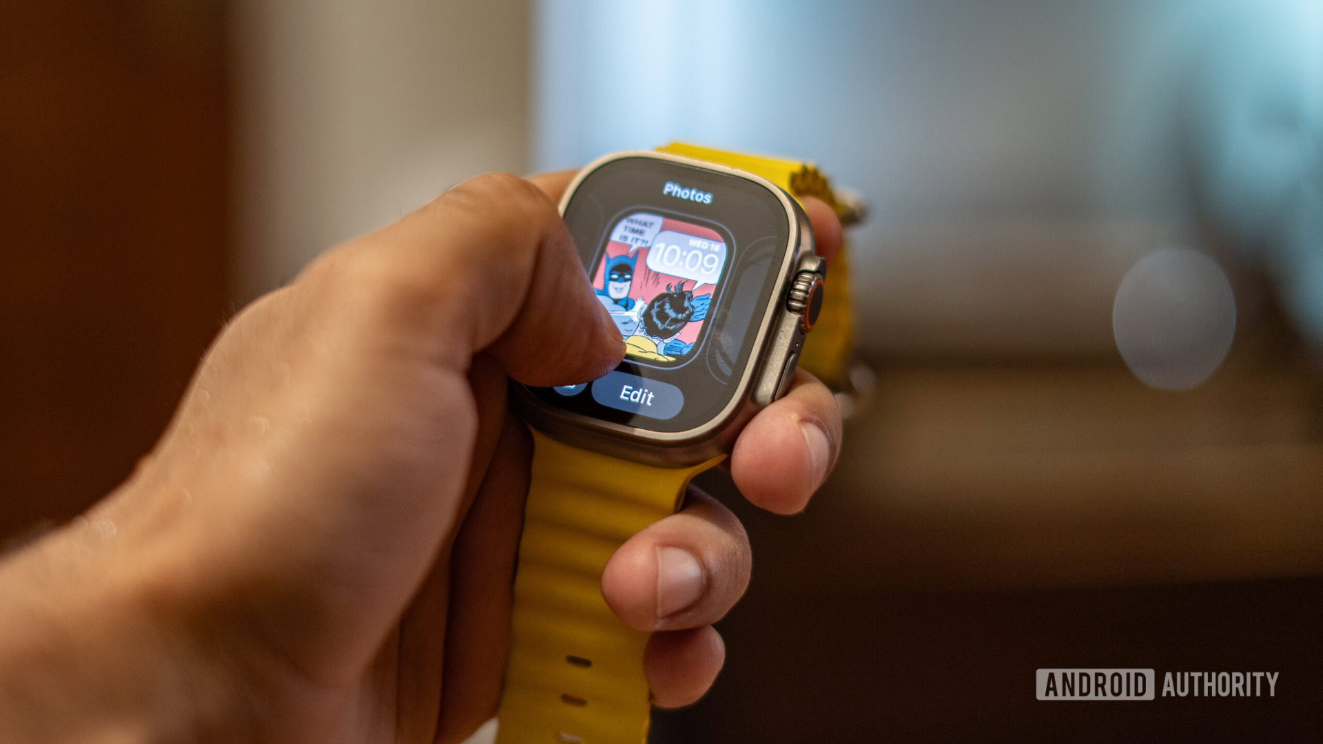
I’ve got an activity-focused Apple Watch face and another with some of my favorite album art; I’ve even got a Batman and Robin-themed watch face. Previously, with watchOS 9, I could swipe my finger across the face of the watch and endlessly scroll through the options till I landed on the one I wanted to sport for the rest of the day or hour. WatchOS 10, however, removes that ability.
watchOS 10 adds unneeded friction to an otherwise effortless personalization process.
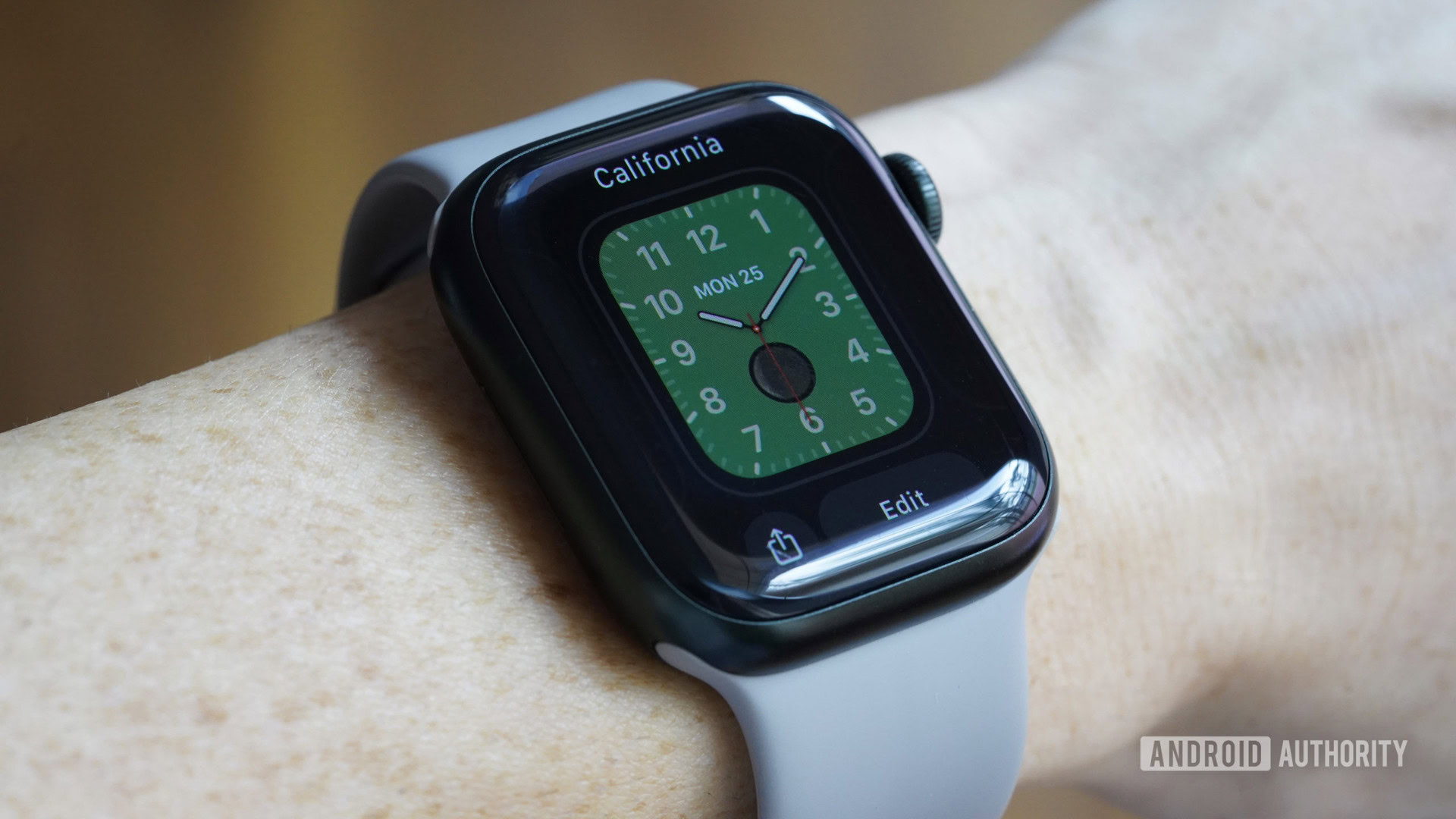
In fact, the aforementioned swipe has been replaced with a more cumbersome process that takes away the much-loved flickability of watch faces. You’ll now have to tap and hold the watch face until you get to the face edit screen. Only then will you be able to swipe across the options. Plus, you’ll still have to activate the fresh watch face by tapping the screen again.
This added friction takes away the quick and easy joy of personalization and makes it a more intentional and purpose-driven process. And in my opinion, it’s a massive step backward for someone like me, who tends to keep a formal and fun watch face placed next to each other for a quick-flick mid-day switch.

Dhruv Bhutani / Android Authority
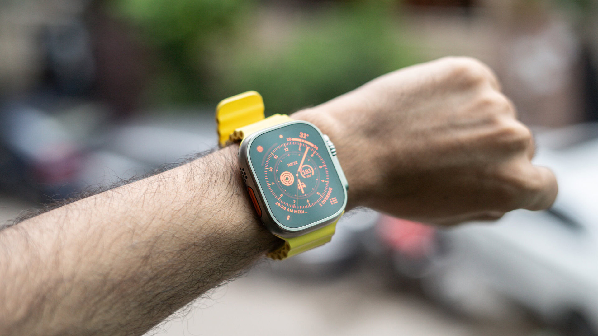
That’s not all. I’ve been using the Apple Watch Ultra since it launched last year, and the Wayfinder watch face has been my perpetual go-to for one big reason.
Rotating the Digital Crown lets me switch it over to an easier-to-read, red-on-black configuration. Seemingly inspired by the Bell & Ross Red Radar watch, I’d find myself switching between the standard white-on-black and the funkier red-on-black configuration multiple times daily. Moreover, based on how much I rotated the crown, I could adjust the screen’s luminosity to eke out slightly more battery life.

Dhruv Bhutani / Android Authority
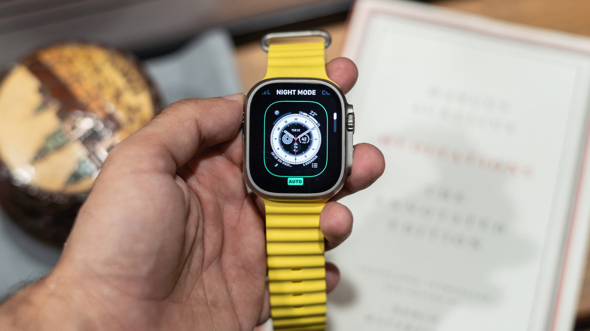
All that is gone with watchOS 10. Instead, my only option is to keep the night mode configuration switched on, off, or on auto mode, where it’ll use the ambient light sensor to toggle it. Why? Because rotating the Digital Crown now pulls up the widget stash, just like swiping up on the watch face.
Apple’s reasoning might make sense, but I’d prefer more flexibility
I can see Apple’s reasoning behind switching up functionality to put widgets ahead. Giving users an additional way to pull up the widgets, perhaps while wearing gloves, is — logically — higher up the priority list than the ability to switch a watch face to night mode (especially knowing that the Wayfinder face is exclusive to the Apple Watch Ultra). However, that doesn’t take away from the fact that it fundamentally changes a feature I was sold on and that directly impacts how I use my watch. Perhaps a user-customizable choice would’ve been the right move here.
It isn’t uncommon for brands to make sweeping user interface changes, but there should always be a fallback option.
You won’t have to look too far to observe that it isn’t really uncommon for a company to introduce a major user interface change just for the sake of change. Apple’s upcoming watchOS 10 software release for the Apple Watch is not one of those instances. It’s part of an ongoing interface overhaul across the company’s iPhone, iPad, Apple Watch, and even MacBook ecosystems to build cohesion and bring over features that Android fans have enjoyed for years. But that doesn’t mean that it has to be an either-or situation.
We’re still a couple of weeks or more from the official launch of watchOS 10, and my experience with iOS betas shows that Apple keeps tweaking the formula all the way till it’s almost time for the public release. I hope there’ll be a better solution to my woes than the current take-it-or-leave-it approach. Until then, if you’re still on watchOS 9, enjoy these features while you still have them.
