We first learned about WhatsApp’s big redesign plans for the Android app about a year ago. The new user interface appeared in beta versions of the app, featuring a significant change that made it look more like its iPhone counterpart. Specifically, WhatsApp moved the navigation bar to the bottom of the screen, where you’ll find it on the iPhone.
That said, WhatsApp didn’t actually go forward with the design change, choosing to continue testing it. The Android redesign reappeared in beta tests but didn’t move to the stable release. Fast-forward to late March and WhatsApp is finally ready for the change. The navigation bar is going to the bottom of the screen, and you can’t do anything about it.
As with any big OS or app redesign, change isn’t always welcome. Google Maps is a good recent example. Google gave its main navigation app a big redesign last year, changing the old color choices to ones that looked more like Apple Maps on iPhone.
The redesign saw plenty of backlash, but nobody could do anything about it. Google rolled out the new design to both iPhone and Android users.
In contrast, the design changes in WhatsApp aren’t as significant as those of Google Maps. It only impacts the navigation bar, which has a new location. But it’s still a significant enough change that some users will likely struggle to adjust.
WhatsApp announced the design update on X, saying it “moved some things around to make it easier to access what you need when you need it.” The new navigation tools are “closer to your thumbs and easy on the eyes.” I suspect the latter is a big reason why WhatsApp changed the design.
I’m a longtime iPhone user who has been using WhatsApp since before Meta (then Facebook) bought the app. I’m already used to the nav bar sitting on the bottom, and I think that’s the right placement, just like it’s easier to interact with the URL bar on a browser if it’s on the bottom of the screen.
I also think it’s in WhatsApp’s best interest to offer a uniform design across platforms. And the iPhone design is better than the now-old Android UI. You might hate it now, but you’ll get used to it.
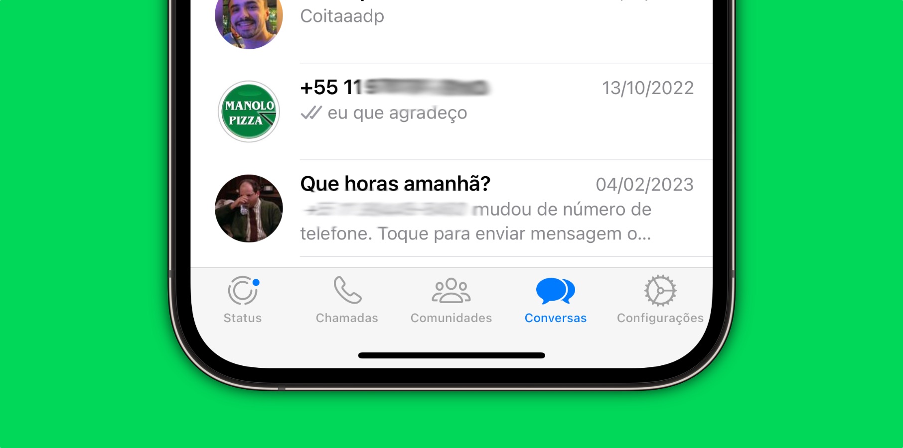
As for the tabs in the nav bar, they’re identical to the previous choices. You get access to Chats, Updates, Communities, and Calls, just like you did before. They’re in a different order, and they’re better spaced than before. Updates replace Status, but the purpose remains the same.
As for design uniformity, the new nav bar placement mirrors the iPhone, but the button order differs.
The only way to stop the change is to delay the update to WhatsApp. But that’s only a temporary solution. Preventing an update means losing out on future features that might be more important than a UI change.
The newest version of WhatsApp for Android also brings a change to the screen-sharing feature for video calls. You can share audio, too, in addition to the screen.